Cameracraft January/February started the A7RIII test report, and March/April 2018 continued it. Both are free to read here. In the second issue you’ll also find the review of the 24-105mm f/4 FE G OSS lens. In the first issue, Gary Friedman looks at the RX10 series and one-inch sensor quality as well – and David tests the Voigtländer Nokton 40mm f/1.2 Aspherical FE manual focus lens, Sigma 16mm f/1.4 DN DC, and Samyang 35mm f/2.8 AF FE.
There’s a dismissive and rather superior position some camera club buffs take – ‘why not zoom with your feet?’. It is well worth ignoring. The focal length of your lens, whether your use a zoom or a range of fixed focal length lenses, decides the exact relationship of elements in the picture including one component you just can’t ‘zoom with your feet’, the sky. The depth of blue above the horizon, the scale of clouds, can only be changed by using a different focal length.
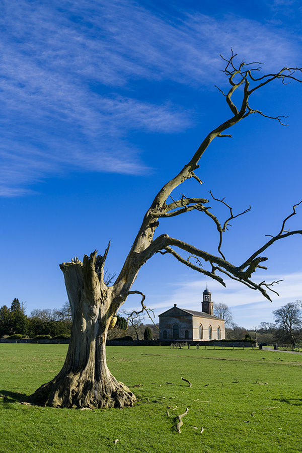
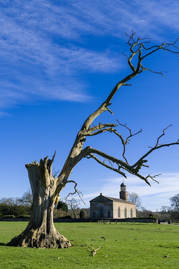
Here is the cover of the May/June 2017 Cameracraft magazine, and in a very rare lapse of judgment I used one of my own photographs. I had never photographed this church before despite driving past it on the A7 Scotland to England road through the ‘debateable lands’ for the last 28 years. A quick left turn down a farm estate road led to St Andrews church of Kirkandrews, an 18th-century gem with the unusual feature of being built on a north-south alignment instead of east-west. This put the late March afternoon sun on to the south door and sundial.
Now this is a typical deliberately uncorrected 24mm steep angle shot, and I also have very straight versions taken from further away on the 24-70mm CZ f/4 lens and A7RII. but they are all at between 24 and 32mm with the church smaller and composition using the churchyard and walls. That’s because the sky simply looks best with a wide angle.
Despite some bad press, I’ve found the 24-70mm to be an excellent lens. You can get good deals and Amazon UK is showing discounts up to 19% – check our affiliate link which helps photoclubalpha cover its costs if you buy.
When we pulled up here, there was a car on the other side of the church spoiling the view I had seen from the road, spotting a dramatic old dead tree. We chatted to a lady who was looking after the churchyard and gardens, a lifelong commitment. She said it was a pity the church was locked as the interior was worth seeing – and left taking her car which had been prominently in my planned shot. So, we parked the car in the field further away, and I returned to the area of the tree.
I knew what I was looking for, and at first walked to a spot and composed this at 30mm. But by moving round and just looking at the possible camera positions (and heights above ground) I could see the relative scale of the church and tree could be changed by finding the best angle of view and perspective. This is what using your feet AND a zoom helps you do, and ‘zooming with your feet’ most certainly does not if all you have is a fixed lens. A 35mm or 28mm would have been fine here, but I knew how much clearance I wanted between the church bell tower and the branch, how large or not I wanted the fallen branches to be (and I do not ‘garden’ subjects like this which are someone else’s property).
This shot at 26mm was able to give me more sky. It’s also one which I could straighten for converging verticals (it has space to do that) using Photoshop/Camera Raw‘s excellent tools for this. To the right, there was an ugly wooden barrier to keep livestock off a sapling. Below, you can see why this was not a good addition to any composition. Earlier on there was that white car between it and the church, which had departed.
From this position, I was generally happy with the scale of the tree and church and their relative weights in a vertical composition, but felt it needed to be a little tighter.
This framing at 35mm kept all parts of the tree clear of the church, placed them neatly and avoided any strong foreground of fallen wood.
This example moved me closer to the tree, at 24mm again, giving the most attractive sky and clouds. But I felt the broken main trunk of the tree was slightly too strong and the ratio between the tree and church just missed the mark. Such small differences do count. Normally I don’t show anyone the ‘ringaround’ compositions, only the final shot. In what is essentially a landscape scene, it’s not always that important. In commercial work, including portraits, wedding or fashion you need to realise that a centimetre or two difference in where you place your lens can distinguish good photography from ordinary. This, and the timing of your shot, also marks out the best press photography.
Precision viewpoint is where both your feet and zooming come in. By moving much closer to the tree, and using it as a solid closure to the left hand side of the image, the small forked branch could be positioned to frame the church and no slightly more ugly broken branch ends would be shown. The closer viewpoint was controlled to within an inch or two side to side and vertically, by crouching slightly to get the lens in exactly the position I wanted.
This also kept the church centred and therefore without converging verticals. I was already seeing this as a black and white conversion, and possibly a cover image, with the space necessary for typical cover lines and logo. This was the picture I did use for the cover.
However, from the same viewpoint zooming to 41mm allowed a different crop with a larger scale to the church.
You can see how I have moved to my left just a small amount, and also stepped back a couple of paces to change the relationship between the forked branch and the church. This is the control you gain from a lens like the 24-70mm – and why you should zoom PLUS your feet, not zoom WITH your feet. Above all, you should walk round and look, even without the camera, studying the interplay between foreground, background, middle distance and the sky.
For my first three years of using the Sony full-frame mirrorless system I have been without a 24-70mm, using a range of primes and the 28-70mm instead. Although I had used excellent work from the 24-70mm f/4 in our magazines, from other photographers, there were so many bad reports about it. But 24mm has always been a critical focal length for me, so I had to buy it when a good deal came up (a refurb from Sony, which allows me to recover the 20% VAT which I can’t claim on regular secondhand items). Well, it’s not perfect because at 24mm the focus field is very curved (cap-shaped) to the extent that detail at the edge of the frame is focused on around 45cm when the centre is set to 45m. This can lead to the idea it’s soft. In fact, this curvature improves the sharpness of the tree trunk and the distant church at f/11 – 42 megapixels can be demanding. But if this was a portrait, with a distant scene beyond, it would have the reverse effect and make the outer field seem less sharp.
David Kilpatrick
Affiliate links to help photoclubalpha if you order the 24-70mm Carl Zeiss Vario-Tessar f/4 FE – B&H Photographic, Amazon, and WEX.
In interviews about the new micron-accurate aspheric lens element moulding process used to increase the resolution of the latest Sony G Master lenses, a visual has appeared which shows the ‘onion ring’ effect that coarser mould machining causes in lens elements.
Working independently, I’ve been aware of this for years – and I have used a point-source photography technique to study lenses. I’m not an optical engineer or scientist, indeed I don’t even have a degree in anything. I came into photography through Victorian books and teenage years experimenting with lenses, developer formulae, building my own equipment and using observation, corollary and deduction to understand how things work. It’s helped me explain difficult technical stuff to many thousands of readers through books and magazines, without using maths or formulae, and very few diagrams.
In the Cameracraft back in 2013 I published a home-brewed rendering of aspheric moulding visual analysis.
Here’s Sony’s visual showing the difference between traditional aspheric moulding (pressed glass aspheric, as pioneered by Leica and Sigma) and their new refined pressing with better engineering.
And here is my home-brewed visual from Cameracraft when I explained the bokeh and resolution issues created by pressed elements (and also, some other aspects of bokeh, which I’ll refer to below the image):
This is the clip from a 2013 article in Cameracraft dealing with broader aspects of bokeh, depth of field, aberrations and how images are rendered. You can download the two-page article here. Nine years after we launched Cameracraft the magazine is going strong, it’s a bit thicker and does have the occasional advert unlike our original, but it is still one of the best ‘never knew that before’ reads a photographer can have drop through the letterbox. You can arrange that easily enough here!
Sony’s new superlens was not any better than the Sigma 70mm f/2.8 macro which I still use. My reasons for choosing this macro are simple – it is optically excellent and traditionally made without any aspheric or other special elements, and it uses simple focal extension for focusing, not rear or internal group movement. This means it’s a true 70mm lens even when used at 1:1 and gives the maximum lens to subject distance, for its focal length.
However, it’s MUCH better than the Voigtländer 50mm f/1.4 used for the colour bokeh shift example at the top. Sony’s information makes it clear that the new more precise aspheric moulding allows new surface profiles and the elimination of chromatic aberrations which cause this magenta-green foreground to background shift in so many otherwise excellent lenses. I’ve said that to do so, the new lenses must be what would once have been called Apochromatic, though that term has only ever meant that all wavelengths focused to the same plane and at the same scale. Even past Apo lenses can show poor colour bokeh. It’s interesting that Sigma, after years of plugging the APO (capitals not actually needed, folks!) label chose not to label some new lenses this way even through their performance matched or exceeded earlier APO models. Sony seems to be taking the same view – G Master will be sufficient label to imply very high resolution, elimination of bad colour bokeh shifts, and by implication an apochromatic performance on RGB sensors.
So will I be buying these amazingly expensive, large, E-mount dedicated lenses? Probably not. My unscientific observations tell me there are smaller, lighter, far less expensive lenses which will serve me better. Mirrorless digital camera bodies with high quality EVF and high magnification focusing allow me to do things I could never have done over 40 years ago when I took my first position as a Technical Editor (of the UK monthly Photography published by Fountain Press and edited by John Sanders). Geoffrey Crawley, editor of the British Journal of Photography, showed me how to evaluate any lens quickly with the help of a light bulb, a darkened studio, a roll of background paper and a sharp pencil. Back then you had to expose film, now you can just look through the finder. In a photo store, any LED spotlight will do for a quick check. Focus centre, magnified to max, at full aperture. Move to all corners in turn without refocusing, magnify each time. Refocus each corner in turn when magnified, examine change in rendering of point source. Buy the lens which shows symmetrical, balanced results and the best sharpness of the corners when the centre is correctly focused. Do this with a light source at least 3m/10ft away and if you can, even further. Repeat one stop down, two stops down, with zooms repeat at three or four focal lengths across the range. Never do it at close distance (hint: lens test chart results are only good for the distance you photograph the chart from, which is why Imatest, DxO and other labs have test targets the size of a wall and industrial sized space to work in).
And, if you have a single LED bulb or miniature LED torch, you can examine any of your lenses in a darkened room and produce a ‘bump map’ which will reveal its moulding defects, scratches or fungus, blemishes, and population of dust and microfauna.
And if you really want a trip back in time – there were huge changes between 2012 and 2015. Cameracraft documents the rise of mirrorless, the growth of hipster retro, and the discovery of older manual lenses as it happened. You can read a full set of the 12 issues via this one-off YUDU subscription:
THIS ARTICLE IS RETAINED AS AN ARCHIVE ITEM BUT READERS SHOULD NOTE THAT THE SUB OFFER NO LONGER EXISTS
STOP PRESS update: Cameracraft issue 1, Q4 2012, will mail out on Tuesday September 11th. Subscriptions placed by the end of Sunday 9th will be included in the mailout. Subscriptions placed after this date may be mailed before September 14th if possible, but the week after that is photokina – and we will be unable to mail out between September 15th and 21st.
One year ago we took the difficult decision to end the publication of Photoworld, though Photoclubalpha continues as an active and well supported site. Thank you for visitng here to see our news posts, reviews of equipment and forum.
I’ve been missing making magazines with true editorial freedom for some time. So, a new quarterly – like Photoworld in quality, starting out with 44 pages and no advertising – is about to appear. The name is Cameracraft, harking back to the West Coast American title (written as two words) which was published in the first half of the 20th century.
Cameracraft is an international magazine. Gary Friedman in Los Angeles is our US Associate Editor with a regular feature article. We’re looking for work of international interest, we have a small open picture gallery in each issue, and we are printing portfolios in classic style as an 8-page central section on heavier silk paper.
The first issue is scheduled for mailing before September 14th and has now gone to press. We will have a subscriber card, we plan a passworded private forum, and we offer optional magazine binders (fitting three years each). We plan to develop exclusive benefits for our readers in future. The subscriber card will be issued late 2012 and sent out with Issue 2 in December, once we’ve worked out a good way to ensure the right cards go to the right people…
On this page you will find a link to a downloadable PDF application form if you are interesting in subscribing and prefer not to use the Paypal payment method. At present the 3-year, 12-issue Cordex bookshelf binder is only offered on the webpage, but the address carrier sheet for the first issue has a form on the reverse for ordering. We expect to ship the binders mid to late October.
I hope you can join me on this new journey. It started over 30 years ago, in 1980, when Minolta Camera Co. of Osaka asked us to run the Minolta Club of Great Britain and upgrade their Photoworld magazine to a high quality colour title which became known as Minolta Image. When Minolta merged with Konica, we changed the name back. After Sony took over the camera brand, they asked us to stop publishing but didn’t offer to refund thousands of club members, so of course, we kept going independently. In Summer 2011 we printed the last copy of Photoworld.
At the time, we promised our remaining readers an Alpha Annual in 2012. For many reasons that has not been possible, and a return to publishing a magazine in quarterly form for a like-minded group of readers proves a more flexible offering. We do have Alpha content, of course, but from now on we can balance this. We’ve had comments along the lines that a 44-page magazine is too slim for a quarterly. Photoworld/Image was 36 pages, and in the last year or two, only 28. I have counted the editorial pages in magazines with 76 or 84 overall and find that most only have 44 (or so) with all the rest being advertising. We think it’s good value and if the readership grows we will take it as far as the printing and postage costs allow.
Best wishes –
David Kilpatrick Publisher and Editor, Icon Publications Ltd and Photoclubalpha