Category: Capture

  • Never say ‘zoom with your feet’…

    There’s a dismissive and rather superior position some camera club buffs take – ‘why not zoom with your feet?’. It is well worth ignoring. The focal length of your lens, whether your use a zoom or a range of fixed focal length lenses, decides the exact relationship of elements in the picture including one component you just can’t ‘zoom with your feet’, the sky. The depth of blue above the horizon, the scale of clouds, can only be changed by using a different focal length.
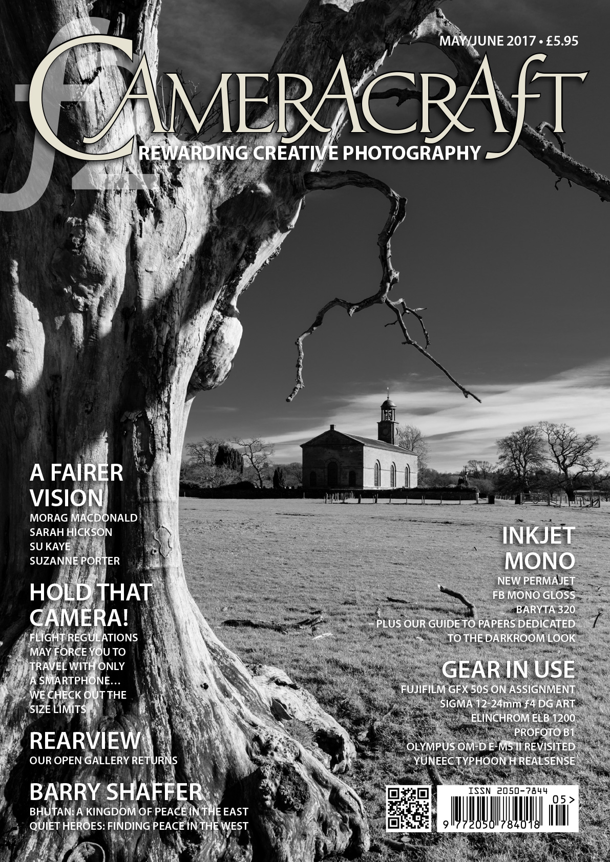
    Here is the cover of the May/June 2017 Cameracraft magazine, and in a very rare lapse of judgment I used one of my own photographs. I had never photographed this church before despite driving past it on the A7 Scotland to England road through the ‘debateable lands’ for the last 28 years. A quick left turn down a farm estate road led to St Andrews church of Kirkandrews, an 18th-century gem with the unusual feature of being built on a north-south alignment instead of east-west. This put the late March afternoon sun on to the south door and sundial.

    Now this is a typical deliberately uncorrected 24mm steep angle shot, and I also have very straight versions taken from further away on the 24-70mm CZ f/4 lens and A7RII. but they are all at between 24 and 32mm with the church smaller and composition using the churchyard and walls. That’s because the sky simply looks best with a wide angle.

    Despite some bad press, I’ve found the 24-70mm to be an excellent lens. You can get good deals and Amazon UK is showing discounts up to 19% – check our affiliate link which helps photoclubalpha cover its costs if you buy.

    When we pulled up here, there was a car on the other side of the church spoiling the view I had seen from the road, spotting a dramatic old dead tree. We chatted to a lady who was looking after the churchyard and gardens, a lifelong commitment. She said it was a pity the church was locked as the interior was worth seeing – and left taking her car which had been prominently in my planned shot. So, we parked the car in the field further away, and I returned to the area of the tree.
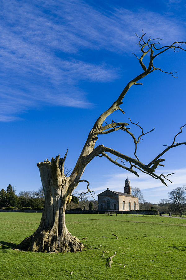
    I knew what I was looking for, and at first walked to a spot and composed this at 30mm. But by moving round and just looking at the possible camera positions (and heights above ground) I could see the relative scale of the church and tree could be changed by finding the best angle of view and perspective. This is what using your feet AND a zoom helps you do, and ‘zooming with your feet’ most certainly does not if all you have is a fixed lens. A 35mm or 28mm would have been fine here, but I knew how much clearance I wanted between the church bell tower and the branch, how large or not I wanted the fallen branches to be (and I do not ‘garden’ subjects like this which are someone else’s property).

    This shot at 26mm was able to give me more sky. It’s also one which I could straighten for converging verticals (it has space to do that) using Photoshop/Camera Raw‘s excellent tools for this. To the right, there was an ugly wooden barrier to keep livestock off a sapling. Below, you can see why this was not a good addition to any composition. Earlier on there was that white car between it and the church, which had departed.

    From this position, I was generally happy with the scale of the tree and church and their relative weights in a vertical composition, but felt it needed to be a little tighter.
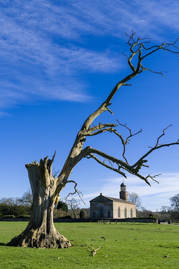
    This framing at 35mm kept all parts of the tree clear of the church, placed them neatly and avoided any strong foreground of fallen wood.

    This example moved me closer to the tree, at 24mm again, giving the most attractive sky and clouds. But I felt the broken main trunk of the tree was slightly too strong and the ratio between the tree and church just missed the mark. Such small differences do count. Normally I don’t show anyone the ‘ringaround’ compositions, only the final shot. In what is essentially a landscape scene, it’s not always that important. In commercial work, including portraits, wedding or fashion you need to realise that a centimetre or two difference in where you place your lens can distinguish good photography from ordinary. This, and the timing of your shot, also marks out the best press photography.

    Precision viewpoint is where both your feet and zooming come in. By moving much closer to the tree, and using it as a solid closure to the left hand side of the image, the small forked branch could be positioned to frame the church and no slightly more ugly broken branch ends would be shown. The closer viewpoint was controlled to within an inch or two side to side and vertically, by crouching slightly to get the lens in exactly the position I wanted.

    This also kept the church centred and therefore without converging verticals. I was already seeing this as a black and white conversion, and possibly a cover image, with the space necessary for typical cover lines and logo. This was the picture I did use for the cover.

    However, from the same viewpoint zooming to 41mm allowed a different crop with a larger scale to the church.

    You can see how I have moved to my left just a small amount, and also stepped back a couple of paces to change the relationship between the forked branch and the church. This is the control you gain from a lens like the 24-70mm – and why you should zoom PLUS your feet, not zoom WITH your feet. Above all, you should walk round and look, even without the camera, studying the interplay between foreground, background, middle distance and the sky.

    For my first three years of using the Sony full-frame mirrorless system I have been without a 24-70mm, using a range of primes and the 28-70mm instead. Although I had used excellent work from the 24-70mm f/4 in our magazines, from other photographers, there were so many bad reports about it. But 24mm has always been a critical focal length for me, so I had to buy it when a good deal came up (a refurb from Sony, which allows me to recover the 20% VAT which I can’t claim on regular secondhand items). Well, it’s not perfect because at 24mm the focus field is very curved (cap-shaped) to the extent that detail at the edge of the frame is focused on around 45cm when the centre is set to 45m. This can lead to the idea it’s soft. In fact, this curvature improves the sharpness of the tree trunk and the distant church at f/11 – 42 megapixels can be demanding. But if this was a portrait, with a distant scene beyond, it would have the reverse effect and make the outer field seem less sharp.

    • David Kilpatrick

    Affiliate links to help photoclubalpha if you order the 24-70mm Carl Zeiss Vario-Tessar f/4 FE – B&H Photographic, Amazon, and WEX.
  • Shaken… and slightly stirred

    I CARRY a camera everywhere, because you never know when a good photograph is round the corner. I also just grab the camera from my office, and rarely think to check the settings. Today, I managed to shoot everything with Super Steady Shot (Anti-Shake) carefully switched off on my Alpha 100.

    In the studio, or when making tests, I may switch SSS off. It’s not needed or desirable with tripod shots, or flash. In fact it can spoil tripod shots by reacting incorrectly to reflected vibrations. Now I have been reminded that I should switch it back on the moment the tripod or flash shoot is finished. That’s what I mean by slightly stirred. Memory stirred. Or intentions. Whether I will remember and intend is another matter.

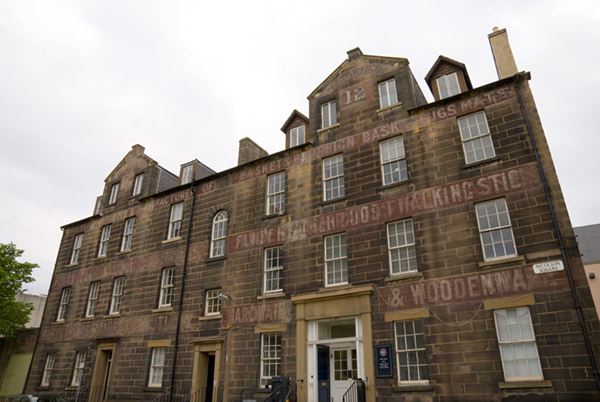
    I only photographed three situations when spending a couple of hours in Edinburgh. I parked near the mosque, which happens to be surrounded by good cafés and close to a music shop I wanted to visit. Ten minutes waiting for good sun on the mosque itself failed me, but in walking on my route I passed a university building with carefully preserved old signs:

    Signs of the past

    This is not a ‘good’ photograph but like many I take, it may have a value to someone writing about architecture, history, or conservation. I’ll revisit it on a better day. It was taken at 16mm on the CZ 16-80mm, carefully focusing at 35mm before zooming back to 16mm, as the lens never focuses accurately at the extreme wide end on the A100. The exposure was a very safe 1/100th at f/10. Even so, the image is not as sharp as I have come to expect from routine hand-held shooting with SSS enabled.

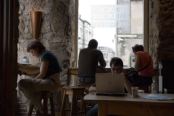
    In a café for a quick lunch, the scene in front of me struck me as pretty good with one internet wifi connection user concentrating on his laptop. A longish first exposure reminded me to switch to ISO 400, but I didn’t check the SSS switch. Nor did I manage to focus any of four different shots as intended. The AF despite being set for centre focus tended to hit the background scene. The CZ, despite being the best lens around optically, is not making friends with me right now.

    Laptop cafe group

    While the lighting is natural, it’s not what I needed for an internet café scene which might find a use in my markets – serious newspapers, magazines, and books or websites wanting natural-looking real life shots. The Black Medicine Coffee Co offers entirely free wifi, and I guess a return visit from time to time might produce a better image. I am happy with the compositional flow, the relative positions of the heads (the elements to which the eye is drawn) but it’s not the best shot, just the best focus.

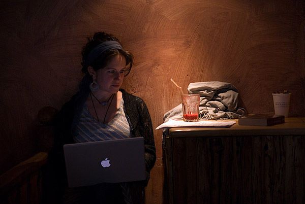
    However, on departing I visited the subterranean loo (Edinburgh basements generally provide loo space) and passed a truly classic composition, partly created by the café’s own decor and lighting, and partly by a perfectly poised Mac Powerbook user with a glowing Apple symbol and a scatter of still-life elements in best Dutch school arrangement!

    Laptop cafe lady

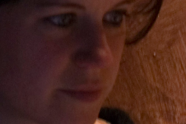
    While I will shoot a group of people without asking, I won’t aim my lens at a single individual without the courtesy of asking permission. There was no problem apart from folk milling about between my lens and my sitter, who was asked just to keep working and not worry about the camera. But, aware that I should work quickly and not take endless pix, I once again failed to spot the SSS was turned off. The exposure was running at around 1/25th wide open, at the long end of the lens. In Leica or Minolta CLE days I would not have thought twice, I could hand-hold this, but I would have taken great care. Breathe in, calm the body’s natural sway, squeeze the shutter smoothly. SSS has made me careless. Also, the small viewfinder of modern DSLRs has made me less aware of focus. For reasons everyone will know, the central focus locked on to the wall, not my subject. I thought I had locked and recomposed, but perhaps the lens made a final tweak and revised my setting. At f/4.5, this was enough to take the edge off the shot. Like it or not, there was shake. All three frames I shot showed shake, one so badly it was not usable. The chosen shot here was on the verge of being unusable when enlarged to A3+ picture library dimensions:

    Section of laptop cafe

    This gives a very unfair view of the shot, since it is enlarged to 17.5 megapixels, and when output to a size suitable for a 6 x 4 inch print it’s as sharp as you could want. We used to try to judge images from 6 x 4 prints. Now, we really can see that bit of directional shake and that focus error. Even so, with the softness and slight ISO 400 noise, it has a painterly look and will go in the library.

    But can anything better be done?

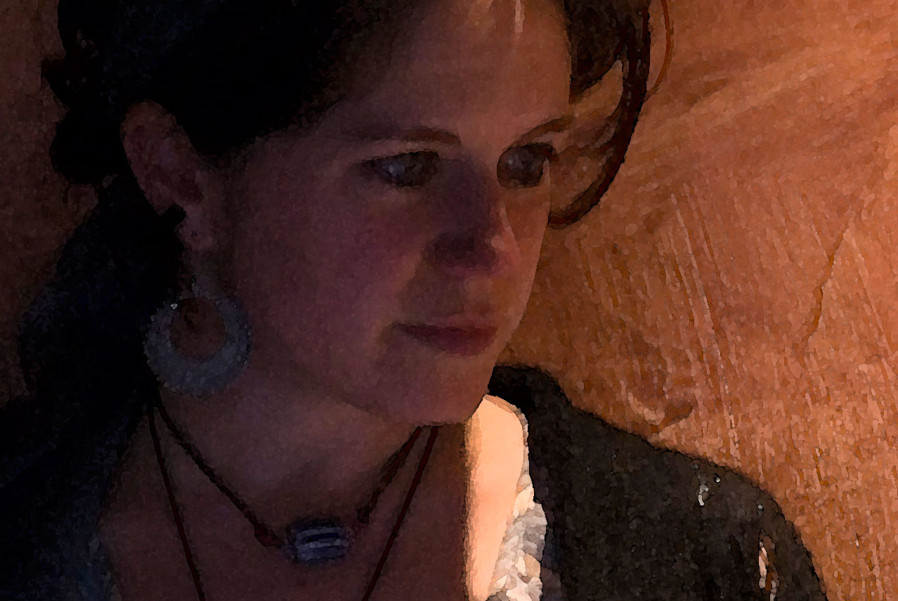
    Photoshop provides an answer. One of the very oldest Artistic Effect filters, Watercolour Paint, is a favourite of mine for prints on watercolour type paper from images which are small, or have focus errors, or noise. It quantises the image into blobby posterized zones with ragged bleed edges and a random overlap. Applied to a shot like this, it also creates perfectly sharp edges to the face and hair, while brightening the eye-whites and the Apple logo. The overall image processed through the Watercolour Paint filter (settings 9, 1, 0) loses any of the distracting imbalance between the sharper painted wall and the portrait element. It also looks uncannily like many of the real art prints on show just over the road from the café! Slightly Vettriano in feel, with solid blacks and simple outlines. Here is a section, after watercolour processing:

    Watercolour at 600

    If you click the photo, you will open a full sized clip (at the size suitable for A3 to A2 printing on watercolour paper). The artificial edges created by the watercolour filter are most effective, and it handles the colour in skin tones well despite producing a dense black for the hair and charcoal shades for the shoulder wrap.

    Obviously there are very few images where this is appropriate treatment, and it is an off-the shelf filter, which makes it not really your own creative work. There are some other options – programs like Painter, and sets of special effect filters – but the same can be said of these as well. In the end, if the process applied to an image makes it serve its purpose better or enhances it visually, reasonable productivity dictates that it’s OK to use ready made shortcuts.

    And one shortcut I must remember not to take is to grab the camera without checking every single setting – including the SSS switch. It is just too easy to shoot all day with it off. In my experience SSS will sharpen up many shots at normal shutter speeds, let alone those at hard to handhold settings. I didn’t lose my shot, but it could have been better.

    As a footnote, in sending my subject a copy of her portrait, I realised we had spoken before (Edinburgh is a very small place) – at a Friends of the Earth Scotland booth during one of the many green festivals or events which happen in the city.

    – David