Thirty keys to stock photography
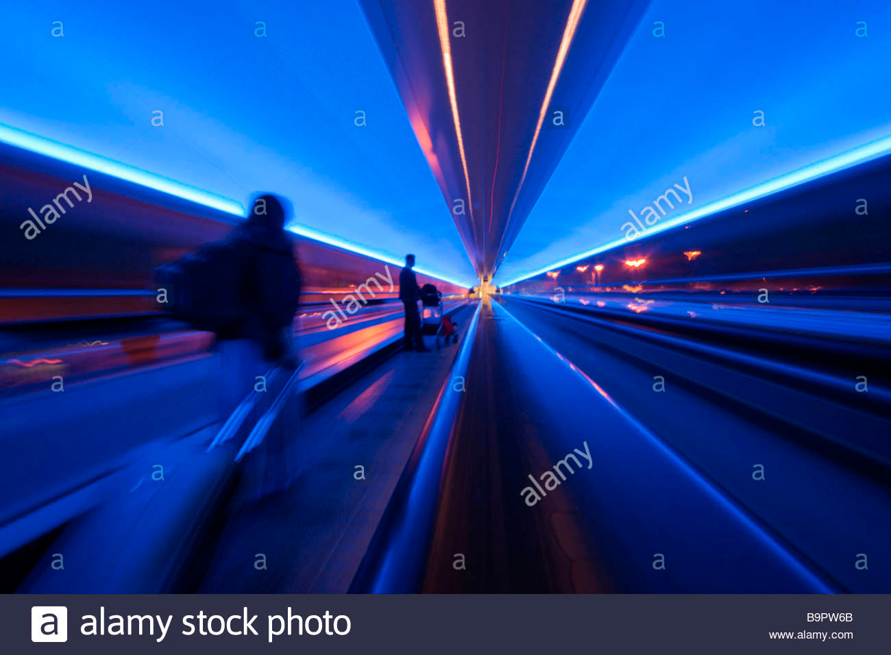
16) Let your intentions be obvious, in terms of visual or photographic technique-effects. By this I mean things such as movement blur, action panned against a blurred background, differential focus effects, extreme horizon tilts, strong convergence, narrow focus zones created using products li
ke LensBaby. Do not ‘moderate’ your effects because you think they may be too strong. If you are going to use techniques which in a minor form resemble photographic faults, make them so deliberate it is clear they are NOT faults…

17) Emphasise the conditions, situation, weather, season, time of day or other factor which you might try to ‘correct’. It is better to make a cloudy sky look dark and stormy than to brighten up the picture and add a fake blue sky. Today’s picture buyers are looking for archetypes, pictures which sum up whatever theme they are trying to illustrate with your image. Don’t try to make a rainy windy day look ‘normal’ by waiting for a weak break in the clouds. Instead, concentrate on making the best rainy, windy shots you can imagine.
18) On location or out and about, choose your colour content carefully (point no 7). Be careful to exclude distracting coloured objects or details. If you can give your shot a definite dominant colour do so. Designers looks for colour to a far greater degree than photographers and will look for shots which completely exclude some colours and emphasise others. This can mean breaking that old (flawed) bit of advice about having a figure in a contrasting coloured coat, or whatever, in your shot. Study paintings and graphics. If you can, avoid including details which will detract. If you can’t get rid of them, consider selective colour adjustment.

19) In the studio, style your shots. Make your own backdrops, buy unusual items, build miniature sets, acquire interesting props which can be used in many shots in different ways. Use colour themes (point no 7) to help you select all the things you can assemble when shooting still life. If your subjects are neutral, consider the idea of using coloured accent lighting but remember this should be what fills in the shadows, not what strikes the highlights and edges. Style your use of viewpoint and lenses and focus as well. Create a ‘look’ for your work so that if a whole page of your images is viewed, it has coherence in the scale and treatment of studio objects.

20) Use studio lighting contrast – digital images tend to have a very flat look, or to be too ‘linear’ in their rendering. They are the exact opposite of colour reversal film. From the 1970s onwards, we learned to use very soft diffuse lighting which worked well with the colour films of the time. Look back to the 1930s to 60s before studio strobe flash was standard, when theatre-style spotlights and floods were the best lighting tools. Digital can’t cope well with highlight overexposure, but it can look great with much more contrasty, direct, textural studio lighting. The problem is that many flash systems are far too powerful to do this, mine included. So I’m still working the old way with easygoing, frankly rather dull softbox lighting. I know this is lazy and I should be rethinking all my lighting styles. Classic Hollywood films can give some inspiration. Use shadows, use rim light, use backlight, use skims and accent lights.
These points are about the look of the picture and could be expanded in detail. What matters is that your pictures should HAVE a look, or a number of looks. Combined with the points earlier on, the ultimate aim would be that your work would be instantly recognisable if scattered through a search result page on Alamy. That’s harder than you think. When I set out as a freelance, my black and white prints were apparently in a class of their own because I used A4 paper when everyone still used 10 x 8, I printed a black border using masks when others did not or printed a raggy border from full frame. That distinction in presentation and size got me through many doors. Then when colour came in my studio was the first in our region to use colourful Fujichrome instead of tired old blue Ektachrome, the first to use Panodia flexible black masks to present our results, so that our images looked MILES better than the competing studios when seen by ad agencies and prospective clients. Even our lighting was better, modern UV-gold coated tubes instead of the high UV content old workhorse flash packs. Our colours were stunning and we took accounts off the ‘old guard’ studios effortlessly.
On the web, in picture library search windows, such distinctions are eliminated. Your image alone is seen alongside others. It has no special presentation, no visible hallmark of quality. Therefore by its visual look only it must stand out.

It all makes sense. Many thanks for such a helpful post, David.
As usual great advice David.
Much of it is not new to me but I have not always (or even often) paid proper attention or had forgotten it. Fortunately your pointing out this piece is timely as I am actually working to raise my photographic game now I can work at it as full time as I wish.
Thank you, these comments and other ideas will play a major part in my business plan for 2014.
About time I read this and follwoed the advice!! All makes perfect sense now!
Pingback: 30 key points about stock photography | dPhotoexpert | Dannyspltd's Blog
Pingback: 30 key points about stock photography | dPhotoexpert « master photography…
Fantastic advice David, and thank you so much for offering so much advice to others on Alamy’s forum. This must consume a great deal of your time – most generous.
Pingback: Stock-photography tips | mikeperris
Pingback: 30 keys to selling photo's | Localfoto.co.uk
Very good and interesting piece of work excellent for all who want to tread down the Stock Highway.
Excellent post! Thanks for sharing. You have provided many useful and helpful tips for all stock shooters to consider.
Clarence
Thanks, David. Will put all your fabulous advice on my 2011 resolutions list.
Bettina
This is Brilliant David, the best stockphotography advice i’ve ever read….A Stockphotographers Bible…Amen to that!
Thank You
Parm Bhandol
Interesting reading David. Hope to make at least some of that into one of my new years resolutions!
Thanks
Phil Crean
David – I adopted your cropping advice from another posting you made about a year ago… cropping a good percentage of my 2:3 format Nikon images down (or up?) to the 4:3 format because a) they do look larger and more impressive as Alamy thumbnails, and b) the 4:3 format crops-off softer image corners.
You certainly set yourself a big task David! There is so much in there to debate but I think I’d make the general comment that ‘rules’ can often be broken effectively to make an image that stands out from the crowd of generic stock. Of course a photographer has to have first learnt and mastered the rules to then reliably consider breaking them! An interesting read, thanks.
Alex
Thanks for the solid 30 keys to stock photography, David.
“The most important lesson I ever learned in photography was the simplest – you can not take a picture without being there”…. with a camera
Best piece of writing on stock photography I’ve seen. Common sense based on long experience. Unbeatable combination.