

Thirty keys to stock photography
6) Let There Be More Light – this is a basic rule for modern stock photography which I’ll admit to breaking. Editors will choose lighter, brighter images over lower contrast, darker, duller images for two reasons. In print, photographs reproduce darker and flatter than their screen version. The most successful stock and commercial producers aim for a surprisingly light, open look. On screen, the RGB gamut colours which never work in print are in the midtone to highlight regions, and website or email shot designers like to use these.
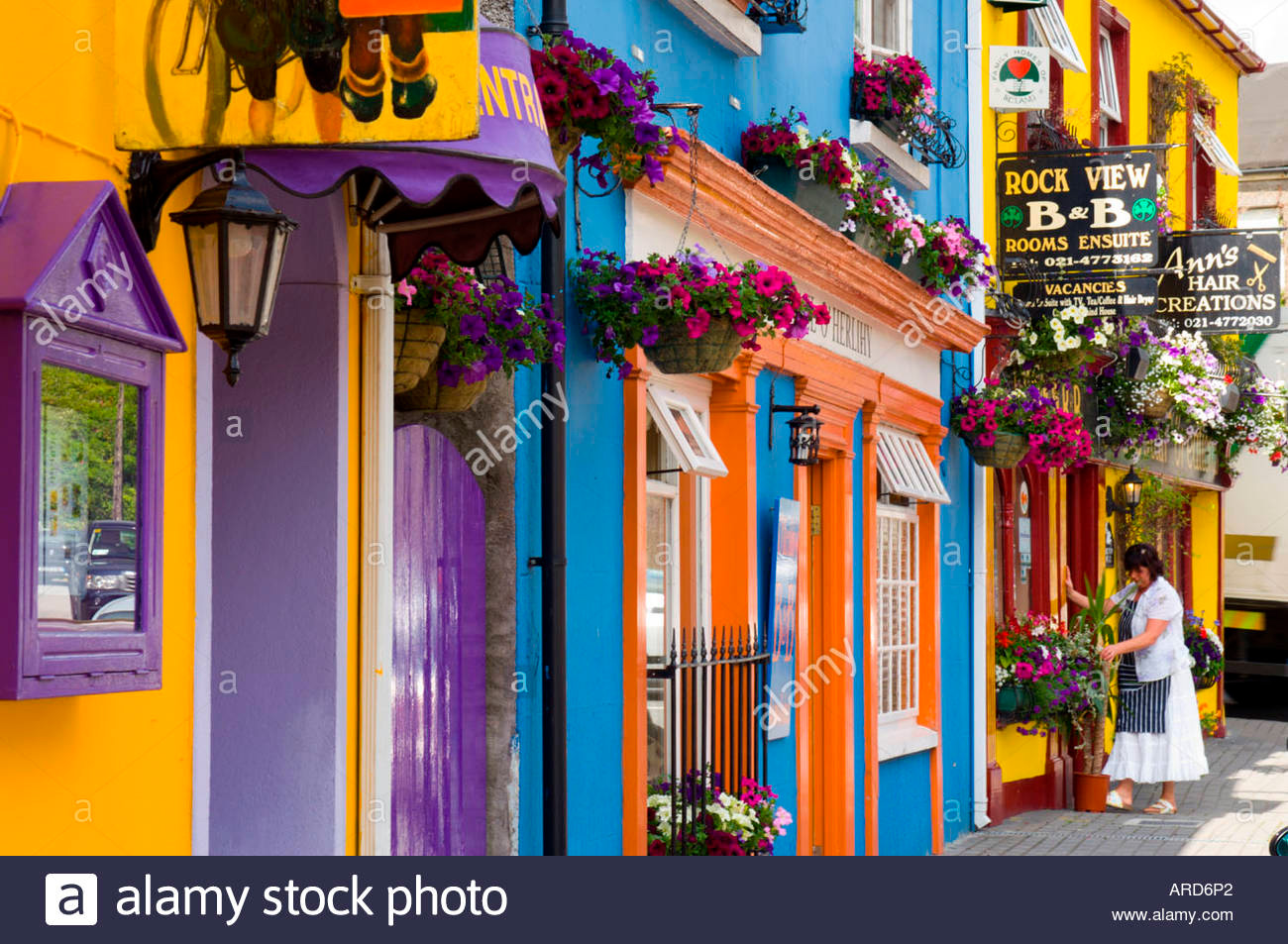
7) Let There Be More Colour – or rather, what designers call a colorway or a colour theme (or what we used to call a palette). If you can compose an image so that all the colours within it are harmonious, complementary, suitably matching or suitably contrasting it will catch the eye of graphic designers. If you are working in the studio, consider creating similar images with different coloured settings or backgrounds. I wrote an article for Amateur Photographer called ‘Hypercolour’ in the mid-1980s which took things to extremes – coloured filters lighting similarly coloured backgrounds, bright yellow lemons on intense blue perspex. But even back then, I also photographed my lemons on white, on pastel shades, and on different saturated colours (all using gels and a light table and offcuts of signmaker’s perspex sheet).
8) Let There Be More Contrast – stock images are sold by catching the eye with thumbnail images. The close-up, simplified aspects mentioned earlier are important to making thumbnails work. Complex images don’t work at a tiny size. But contrast, pure light and shade, adds most to thumbnails. One very good contributor to Alamy, Simon Stanmore, commented that he regularly defaults to maximum 100% contrast when processing with Adobe Camera Raw. I was surprised; that’s a bit extreme. But actually, it’s not. While 0% contrast is a useless setting in ACR or Lightroom, 100% does not reduce images to lith quality pure black and white. It is actually a useful setting.
9) Bracket Your Effects – Alamy, as an example, don’t like to see more than five ‘similars’ from a subject. If you must have five similars, make them five differents! For example, with some shots of a distinctive skyline rather than submit five straight-processed shots, I processed a couple of normal results, a warmer effect, a fake sunset colour and a fake moonlight colour. All used contrast, of course, and the variants used strong colour. Those coloured versions (achieved by changing the colour temperature during raw conversion) increase the chance of a sale.
10) Remember Black and White – this is a very, very important issue. Well over half all professional images sold to the public are monochrome. It’s a different medium and it can be hard to think black and white when shooting digital and defaulting to colour. B&W has great potential and you only need to study the search results from any on-line library to see just how little B&W is there, compared to the proportion of B&W used. I believe it will become more popular not less so. I am not suggesting you should shoot all the time for B&W, but when it seems to enhance an image, do not hesitate to use it.
These points are about the look of a processed image. To a degree, they may involve camera technique (lighting and exposure) but most of this is linked to how you process your pictures. Remember, if you use nothing but the default raw conversion or even in-camera JPEGs (good enough these days for stock) your pictures will look pretty much like all the other results on a search page. I am no-one to lecture on this, I am far too conservative and do not use strong enough processing settings. My images are too neutral.
It all makes sense. Many thanks for such a helpful post, David.
As usual great advice David.
Much of it is not new to me but I have not always (or even often) paid proper attention or had forgotten it. Fortunately your pointing out this piece is timely as I am actually working to raise my photographic game now I can work at it as full time as I wish.
Thank you, these comments and other ideas will play a major part in my business plan for 2014.
About time I read this and follwoed the advice!! All makes perfect sense now!
Pingback: 30 key points about stock photography | dPhotoexpert | Dannyspltd's Blog
Pingback: 30 key points about stock photography | dPhotoexpert « master photography…
Fantastic advice David, and thank you so much for offering so much advice to others on Alamy’s forum. This must consume a great deal of your time – most generous.
Pingback: Stock-photography tips | mikeperris
Pingback: 30 keys to selling photo's | Localfoto.co.uk
Very good and interesting piece of work excellent for all who want to tread down the Stock Highway.
Excellent post! Thanks for sharing. You have provided many useful and helpful tips for all stock shooters to consider.
Clarence
Thanks, David. Will put all your fabulous advice on my 2011 resolutions list.
Bettina
This is Brilliant David, the best stockphotography advice i’ve ever read….A Stockphotographers Bible…Amen to that!
Thank You
Parm Bhandol
Interesting reading David. Hope to make at least some of that into one of my new years resolutions!
Thanks
Phil Crean
David – I adopted your cropping advice from another posting you made about a year ago… cropping a good percentage of my 2:3 format Nikon images down (or up?) to the 4:3 format because a) they do look larger and more impressive as Alamy thumbnails, and b) the 4:3 format crops-off softer image corners.
You certainly set yourself a big task David! There is so much in there to debate but I think I’d make the general comment that ‘rules’ can often be broken effectively to make an image that stands out from the crowd of generic stock. Of course a photographer has to have first learnt and mastered the rules to then reliably consider breaking them! An interesting read, thanks.
Alex
Thanks for the solid 30 keys to stock photography, David.
“The most important lesson I ever learned in photography was the simplest – you can not take a picture without being there”…. with a camera
Best piece of writing on stock photography I’ve seen. Common sense based on long experience. Unbeatable combination.