Never say ‘zoom with your feet’…
There’s a dismissive and rather superior position some camera club buffs take – ‘why not zoom with your feet?’. It is well worth ignoring. The focal length of your lens, whether your use a zoom or a range of fixed focal length lenses, decides the exact relationship of elements in the picture including one component you just can’t ‘zoom with your feet’, the sky. The depth of blue above the horizon, the scale of clouds, can only be changed by using a different focal length.
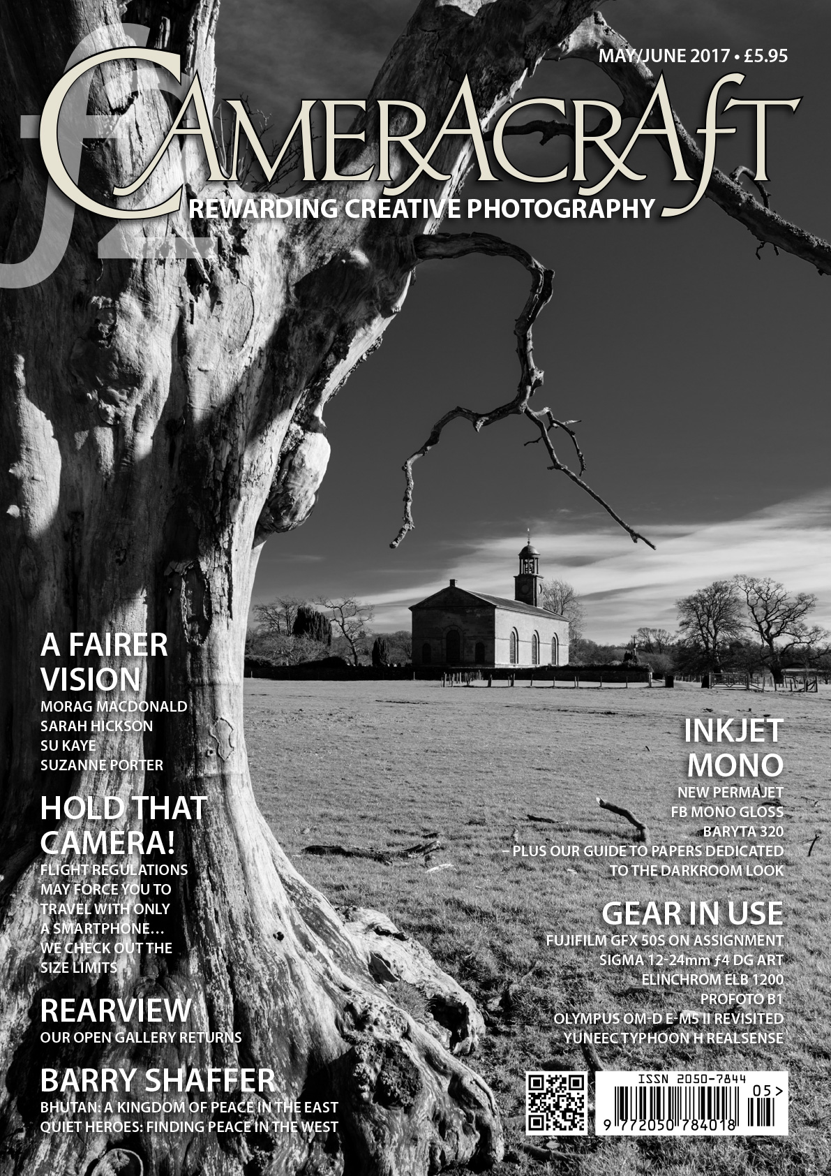
Here is the cover of the May/June 2017 Cameracraft magazine, and in a very rare lapse of judgment I used one of my own photographs. I had never photographed this church before despite driving past it on the A7 Scotland to England road through the ‘debateable lands’ for the last 28 years. A quick left turn down a farm estate road led to St Andrews church of Kirkandrews, an 18th-century gem with the unusual feature of being built on a north-south alignment instead of east-west. This put the late March afternoon sun on to the south door and sundial.

Now this is a typical deliberately uncorrected 24mm steep angle shot, and I also have very straight versions taken from further away on the 24-70mm CZ f/4 lens and A7RII. but they are all at between 24 and 32mm with the church smaller and composition using the churchyard and walls. That’s because the sky simply looks best with a wide angle.
Despite some bad press, I’ve found the 24-70mm to be an excellent lens. You can get good deals and Amazon UK is showing discounts up to 19% – check our affiliate link which helps photoclubalpha cover its costs if you buy.
When we pulled up here, there was a car on the other side of the church spoiling the view I had seen from the road, spotting a dramatic old dead tree. We chatted to a lady who was looking after the churchyard and gardens, a lifelong commitment. She said it was a pity the church was locked as the interior was worth seeing – and left taking her car which had been prominently in my planned shot. So, we parked the car in the field further away, and I returned to the area of the tree.
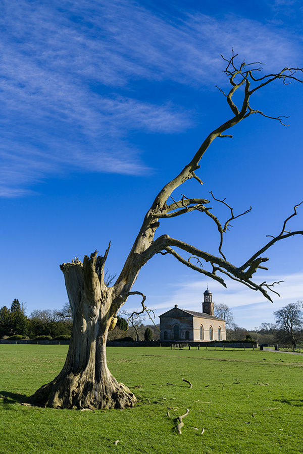
I knew what I was looking for, and at first walked to a spot and composed this at 30mm. But by moving round and just looking at the possible camera positions (and heights above ground) I could see the relative scale of the church and tree could be changed by finding the best angle of view and perspective. This is what using your feet AND a zoom helps you do, and ‘zooming with your feet’ most certainly does not if all you have is a fixed lens. A 35mm or 28mm would have been fine here, but I knew how much clearance I wanted between the church bell tower and the branch, how large or not I wanted the fallen branches to be (and I do not ‘garden’ subjects like this which are someone else’s property).

This shot at 26mm was able to give me more sky. It’s also one which I could straighten for converging verticals (it has space to do that) using Photoshop/Camera Raw‘s excellent tools for this. To the right, there was an ugly wooden barrier to keep livestock off a sapling. Below, you can see why this was not a good addition to any composition. Earlier on there was that white car between it and the church, which had departed.

From this position, I was generally happy with the scale of the tree and church and their relative weights in a vertical composition, but felt it needed to be a little tighter.
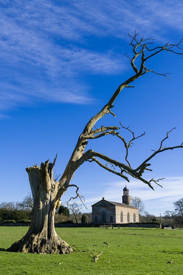
This framing at 35mm kept all parts of the tree clear of the church, placed them neatly and avoided any strong foreground of fallen wood.

This example moved me closer to the tree, at 24mm again, giving the most attractive sky and clouds. But I felt the broken main trunk of the tree was slightly too strong and the ratio between the tree and church just missed the mark. Such small differences do count. Normally I don’t show anyone the ‘ringaround’ compositions, only the final shot. In what is essentially a landscape scene, it’s not always that important. In commercial work, including portraits, wedding or fashion you need to realise that a centimetre or two difference in where you place your lens can distinguish good photography from ordinary. This, and the timing of your shot, also marks out the best press photography.
Precision viewpoint is where both your feet and zooming come in. By moving much closer to the tree, and using it as a solid closure to the left hand side of the image, the small forked branch could be positioned to frame the church and no slightly more ugly broken branch ends would be shown. The closer viewpoint was controlled to within an inch or two side to side and vertically, by crouching slightly to get the lens in exactly the position I wanted.

This also kept the church centred and therefore without converging verticals. I was already seeing this as a black and white conversion, and possibly a cover image, with the space necessary for typical cover lines and logo. This was the picture I did use for the cover.
However, from the same viewpoint zooming to 41mm allowed a different crop with a larger scale to the church.

You can see how I have moved to my left just a small amount, and also stepped back a couple of paces to change the relationship between the forked branch and the church. This is the control you gain from a lens like the 24-70mm – and why you should zoom PLUS your feet, not zoom WITH your feet. Above all, you should walk round and look, even without the camera, studying the interplay between foreground, background, middle distance and the sky.
For my first three years of using the Sony full-frame mirrorless system I have been without a 24-70mm, using a range of primes and the 28-70mm instead. Although I had used excellent work from the 24-70mm f/4 in our magazines, from other photographers, there were so many bad reports about it. But 24mm has always been a critical focal length for me, so I had to buy it when a good deal came up (a refurb from Sony, which allows me to recover the 20% VAT which I can’t claim on regular secondhand items). Well, it’s not perfect because at 24mm the focus field is very curved (cap-shaped) to the extent that detail at the edge of the frame is focused on around 45cm when the centre is set to 45m. This can lead to the idea it’s soft. In fact, this curvature improves the sharpness of the tree trunk and the distant church at f/11 – 42 megapixels can be demanding. But if this was a portrait, with a distant scene beyond, it would have the reverse effect and make the outer field seem less sharp.
- David Kilpatrick
Affiliate links to help photoclubalpha if you order the 24-70mm Carl Zeiss Vario-Tessar f/4 FE – B&H Photographic, Amazon, and WEX.