AI cuts reflections in glasses

This is a follow-up to our last post about PortraitPro. Using a self-portrait taken for the purpose with bad reflections in uncoated reading specs, I went through the options of the reflection removal process. Mid-May a 15% discount was authorised for code CC524 at www.anthropics.com which applies to all 50% discounted program downloads.

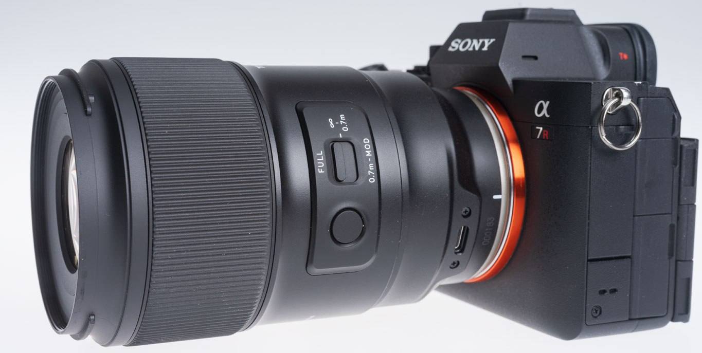
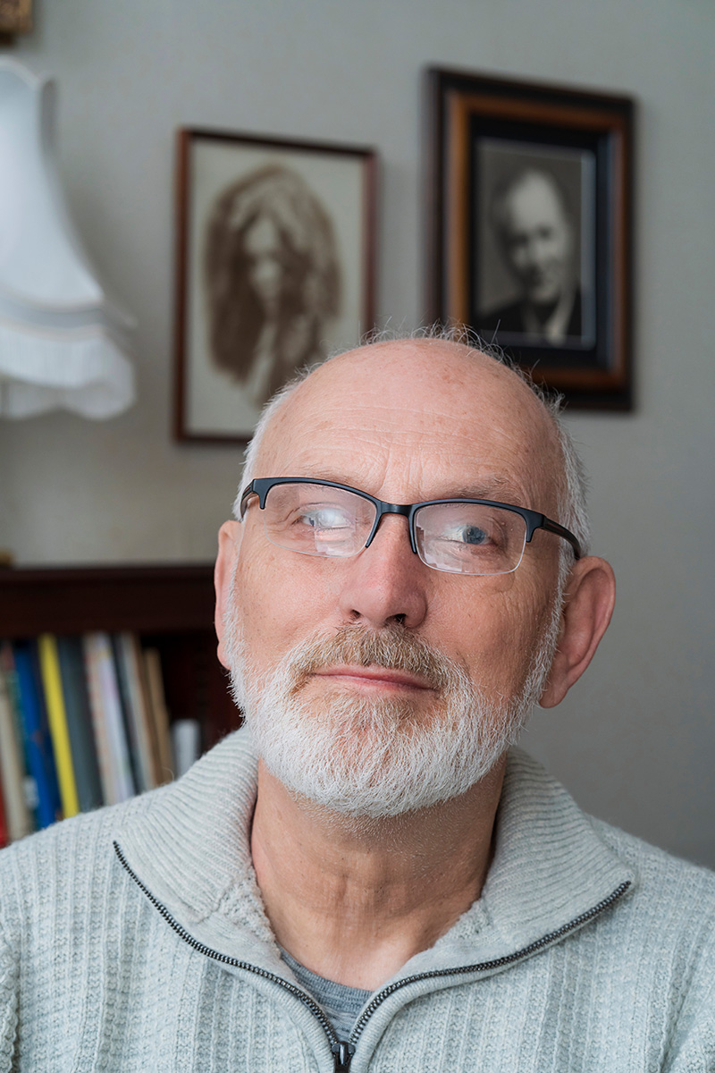
It was taken on the Sony A7IV with 85mm f/1.8, tripod, ISO 400, lens at to f/8 and control through iPhone 15 Pro Max using Sony Creators’ App remote viewing and control. The screen on the A7IV was vertical and facing me, so I could also look at the camera and see the reflections move as I changed my head angle. Setting this up showed me some problems with the A7IV articulated screen design I had not realised – it can only face the self-portrait subject when folded out at the left-hand end of the camera, which with a Arca-Swiss L-plate means hanging down… obscured by the tripod head! So no L-plate but standard Arca small plate, and camera upside down compared to normal hand holding.

This is the result using PortraitPro V24. Read on to learn more, and don’t forget if you decide to get this program use Cameracraft’s additional 10% discount code, CCV245.

PortraitPro has come a long way in a few years. At the top end, the Studio Max version is a £308 program which costs £154 with the 50% download discount that Anthropics have offered ever since the days of CDs in packaging. Since no-one now buys a CD, the real price is £154 (with 10% off for Cameracraft’s code, CV245 in the latest May/June issue).

You may not need Studio Max with its 48-bit file capability, workflow from raw to exported finals, multiple image batch processing intended to auto retouch complete portrait sessions, handling of wedding groups and granular control fine-tuning its effects. The basic V24 includes this function and costs £99 less 50% download only less our 10% – so £44.55.

It is now very fast indeed on Apple Silicon and integrates with Adobe’s photo programs. Under the hood it uses some of Adobe’s functions, without venturing into Generative Fill AI to change a digital capture beyond the scope of many competitions. It uses AI, but does not rely on on stolen images or ones licensed for almost nothing in bulk from the big picture libraries. Anthropics built their platform on measurements of the human face and body, research into what people like or dislike, and many years of coding. When it uses image-based AI it draws that from your photo and its bank of facial features modelling data.

The Reflections in Glasses problem

Recently we came across a question in a professional photo organisation Facebook group asking how it was possible to remove reflections from glasses. It’s very difficult, and when it happens in a set of pictures where the photographer is unable to prevent it, it can ruin groups and presentation shots. Many battery studio-location flash heads now have very low power modelling and it’s all too easy to light your subject and fail to spot that your octa-box is reflecting in specs.

PortraitPro’s specimen example might just be good luck, so I decided to test Version 24. My studio room has shutters when blackout is needed. Two pure white plain blinds 110 x 220cm cover the tall south facing windows to prevent furniture, fabrics, art and photographs fading or warping in direct heat. They make a wonderful giant dual light source in daytime sun even in midwinter but reflect in glasses when the camera angle is not just right.

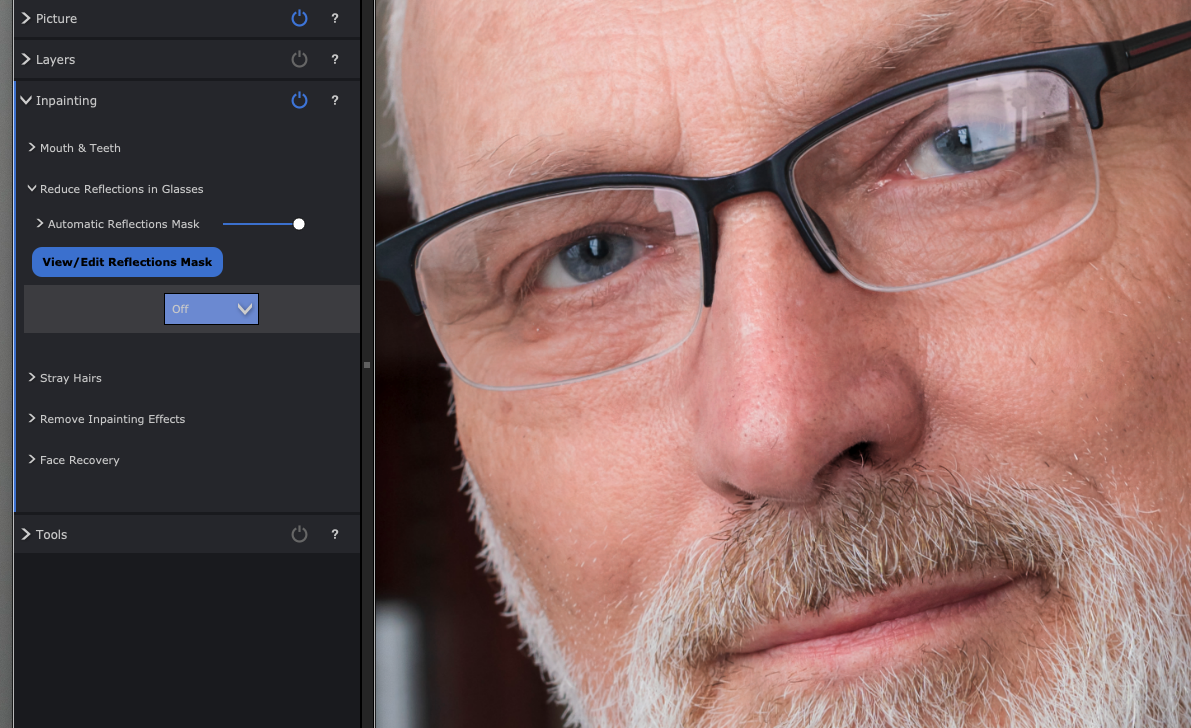
Removing reflections from specs does not come under the Eye menu – it’s under the “Inpainting menu” along with Mouth & Teeth and Remove Stray Hairs.

This is a crop from the original file.

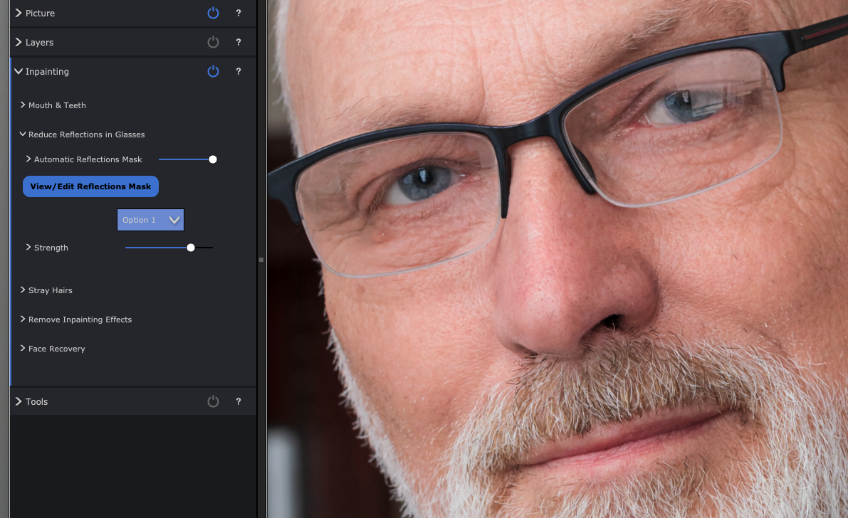
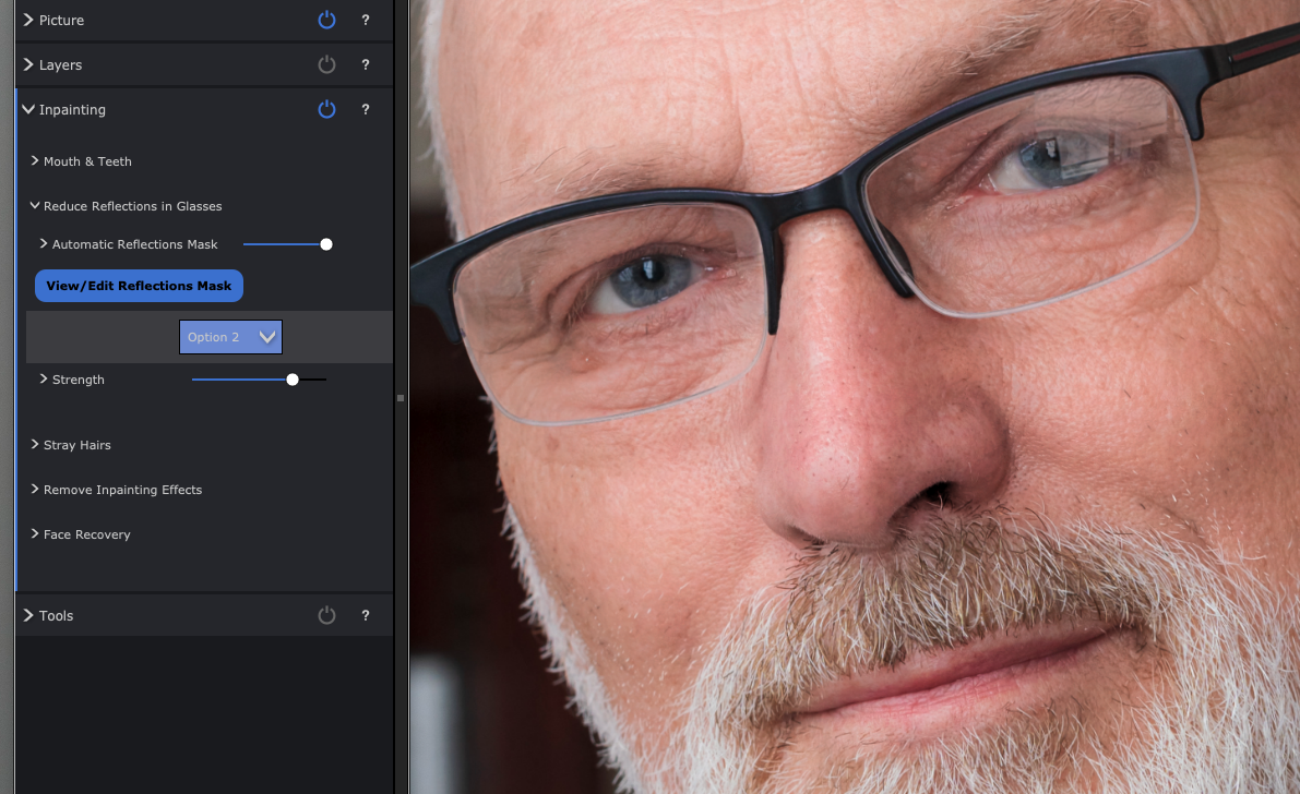
The Reduce Reflections in Glasses view above shows other retouching functions too (notice some reductions in skin blemishes and wrinkles) but has the reflections reduction set to Off. When you select Remove Reflections in Glasses, you see choices for Off (the start position) then Options 1 to 5. Each is a different AI generated restructuring of what should be visible through the reduced reflection. My eyes are old enough to be slightly difficult and it was interesting to see the five choices.

Option 1

Option 2 (note the left eye eyelid in all these and how it changes).

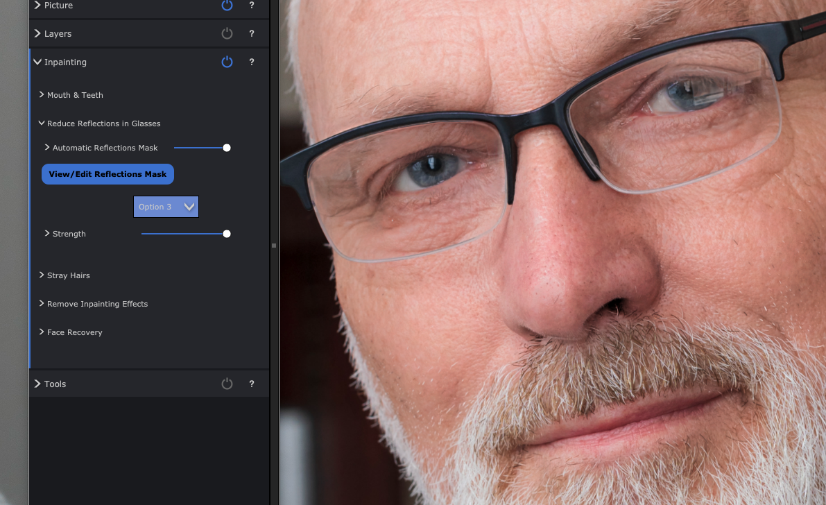
Option 3 which I felt got the eye almost right, though further retouching would be needed for a portrait. It would be good enough for a PR or informal shot.

Option 4 rather odd mismatched detail.

Option 5 eyelid droop…

Option 3 got the upper eyelid almost perfect (not quite but acceptable) and the Strength slider did allow the reflection to be eliminated to the degree shown above. However, it looked better with 85% effect or even the 50% of the earlier example, a faint reflection remaining without obscuring the eye.

The time taken on my Mac M2 Studio Max was next to nothing, I didn’t bother to time it as everything happens in real time include the export from the starting 33MP JPEG to a same size with all PortraitPro’s very subtle modification of the portrait. The defaults were just right but I increased fine wrinkle reduction out of vanity!

After saving a copy of processed result I also saved a .ppx file (the Project) which is a bit like an Adobe .XML sidecar file, and re-opens your original with all the edits at the point you saved this snapshot, reversible and adjustable as needed.

A tougher test

Here’s a worse example than anything you should end up with, so I set maximum strength on this. Option 4 worked best, and despite my eyes being almost entirely obscured by double reflections in my computer reading specs, it was not a bad fix at all. My ‘proper’ specs are coated of course and don’t reflect as badly.

I’m sure I could ask Adobe AI to do something the Generative Fill after masking the reflection area, but in the time it would take me to brush a mask in place, the entire PortraitPro glasses reflection removal would be done and dusted. Is it worth £139 (after our code CCV245 discount)? That depends on what your time is valued at and whether you ever encounter an error in shooting which leaves reflections ruining a shot.

– David Kilpatrick

To see Anthropics PortraitPro Studio Max, and the other versions which start from £49.95 (right now there’s a 15% CC524 discount, update May 23rd 2024) – all include this reflection removal function alongside stacks of other tools – go to https://www.anthropics.com/portraitpro/

Goodbye white sky…

With cloud covering much of Britain and our own home territory in near the North Sea coast shrouded in featureless white for days, remember that post-processing can transform landscapes

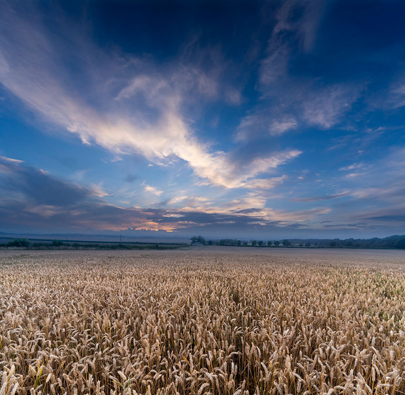
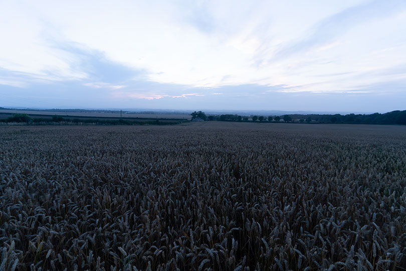
This was just a few days ago when the promise of a sunset disappeared. The sky was taken ten minutes before I expected the best sunset, and shot without any ground – it had potential for use as a stock sky to compose into other shots. The ground, a field of wheat taken from the highest point looking north-west a short distance from our office, was shot hand-held with a 1/5th exposure, stabilisation providing a sharp image from the 17-28mm Tamron FE Sony lens – but the wind blowing the crop selectively, so some ears show contrasting movement.

And that, above, is what a straight conversion from the raw capture looked like (you can also see how the sky had not morphed into a lovely sunset but instead lost any colour and became a neutral dusk). The point is that even a shot like this, in conditions like this, can be turned round by adjustment from raw and combining two frames. The almost square result is also a 170MB file, big enough for an acceptable print the size of some living room walls.

Landscape Pro as a solution when the weather lets you down

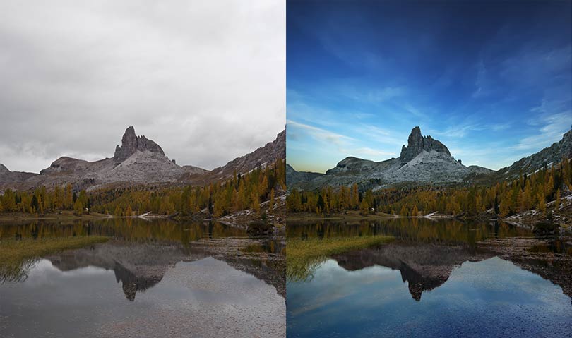
We used Photoshop for this but if you don’t have a full Mac or PC editing program, Anthropics’ Landscape Pro is purpose-designed for even more complex fixing-up and comes with its own library of royalty-free sky images (you can add your own). Here’s an example from Anthropics:

This one uses the masking functions of Landscape Pro to fit the sky to the shape of the rocks, and its controls to define water, mountain and trees as separately adjustable zones. There is also an intelligent function to create reflections in water with a realistic density. Notice that the water-weed in the foreground remains intact in the processed image and the sky reflection has been very accurately masked at the left hand side.

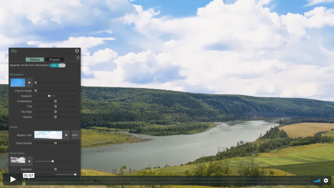
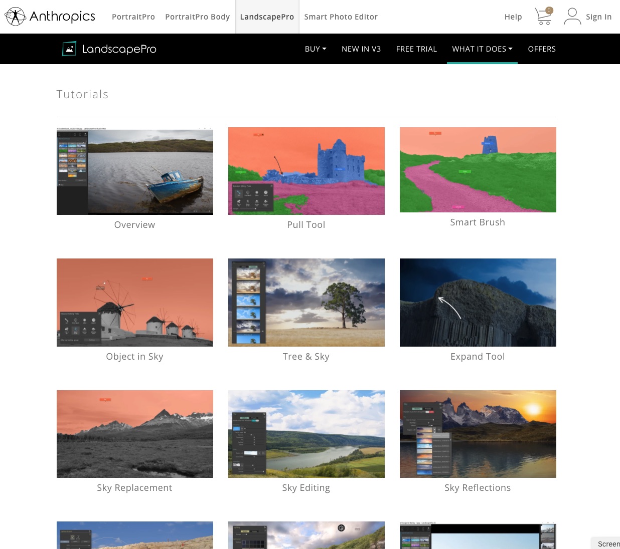
Using the program is well explained in a series of short videos on the Landscape Pro website. These are not the tedious kind of how-to vids you tend to find on YouTube which seem to aim to take several minutes to get to the point, maybe to enable advertising to appear. They are short and very clear in their message, and there’s a good selection (screen shot below).

There is a discount offer of 50% at the moment and an additional 20% off with our code CC8L – this code was not working when this post went out on August 16th due to a technical glitch, it is now working and can be used up to Sunday August 23rd.

Save on Landscape Pro & Portrait Pro using Cameracraft code CC8L

Code valid on any Anthropics software (PortraitPro, PortraitPro Body, LandscapePro or Smart Photo Editor), new editions, upgrades, or bundles. Download your free trial today! 50% OFF sale now on + for an EXTRA 20% OFF use the code CC8L.

LandscapePro – changing your world

If they want to fake a Mars colony story, a video version of British software developer Anthropics’ LandscapePro could be useful. It’s from the same team who created PortraitPro, and it allows you to change almost any landscape beyond recognition. It also allows subtle and careful modifications, or essential commercial fixes like a better sky in place of blank white.

One September weekend, a visit to a local restored mansion and park (The Haining, Selkirk, in the Scottish Borders) was rewarding because the Moving Image Makers’ Collective had video art installations running in the house.

Above is a film with dual projectors using the corner of a room (by Jason Moyes, with power making its way from hydro-electric dams to lonely wires and pylons).

Outside things were not as inspiring.

Of course the components of a closer shot, using the ‘quay’ as a foreground, perhaps in black and white, are there. But from this view as I walked past, not really photogenic.

Here’s where LandscapePro can perform any number of tricks, some familiar from sets of actions or presets like a sepia vignetted contrast-boosted vintage look. But it’s the tools which let you mask off different areas, named in the control menus, that give the program (whether plug-in or stand alone studio edition) its power.

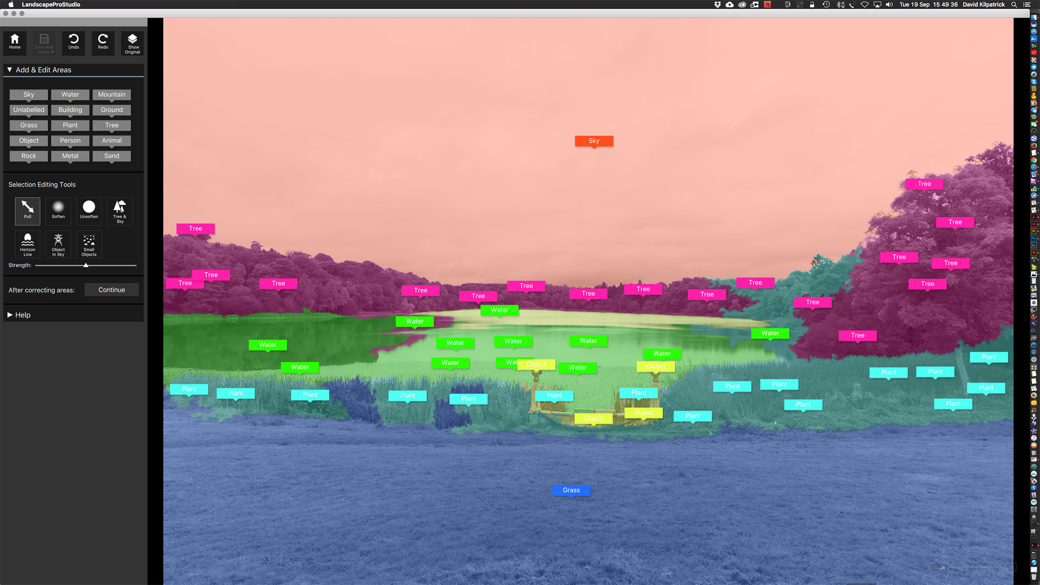
This is a screen shot during progress of auto-painting the masks by dragging the named tags on to various parts of the image. You can then refine them by expanding any part. It’s pretty difficult to mask complex tree horizons as on the right, and some post-process work in Photoshop may be needed. My not-serious rework here is a quick job. You could spend an hour or two setting up the masks for an important image. Even so, the program handles a Sony A7RII 42 megapixel JPEG well enough and most actions are as fast as you can shift the cursor

My idea here was make the scene look like a frosty morning sunrise. The sky is one of my other shots, not a LandscapePro stock sky (the program comes with a good selection but I prefer to keep all parts of an image my own work). The post-pro includes a method for getting rid of a white outline on the woods – you use the Healing Brush tool in Photoshop, set it to Darken, choose a source point in the sky above the horizon, and paint. A similar technique using the Brush tool set to darken with a sampled colour from the lake fixes original tones showing between the reeds. I find the Clone, Brush and Healing Brush tools very useful when combined with Darken or Lighten and controlled flow; I don’t retouch using Layers but have always worked ‘fast and clever’ on the background (single layer), after doing most of the image control and adjustments in Adobe Camera Raw which gives me an .XML sidecar saved non-destructive edit as complex as I need. Mostly, I don’t have to retouch at all in Photoshop. Both PortraitPro and LandscapePro suit me well as they are very fast to use and non-destructive; generally, you can’t see they have been used, especially PortraitPro, because I only use it when needed and then pick specific controls. It is easy to go over the top with these programs as this example shows, but this does not detract from their serious value for careful work.

For this image I also copied the sunset/rise area, flipped it vertically, and used the Clone tool to overpaint from the flipped version down into the lake to give a reflected sun glow. Colour changes have also been made to the trees.

Above you can see, close up, a detailed section with the original top and the processed version bottom. This should demonstrate that the program is not just a gimmick. I used to work with UltiMatte, Mask Pro and other programs which allow painted masking but the multiple different mask zones of LandscapePro take this a step further. Needless to say it’s a godsend for architectural photographers as the clean edges in most architectural shots allow rapid perfect masking and then each face of a building, ground area, sky and landscaping can be adjusted separately. You can work from raw files or from open images in Photoshop (as I did here – it’s not really a JPEG until saved).

You can try LandscapePro at www.landscapepro.pics, and get a 10% discount by using the coupon code F278. If you want to try Anthropics’ PortraitPro visit www.portraitprofessional.com, again we have a discount code – F2910.

UPDATE: August 2020 – until August 17th, use code CC8B on current 50% off deals to get a further 20% off any edition or upgrade of both programs. Visit this link.

– David Kilpatrick
 

Is retouching acceptable?

There’s been a controversy surrounding Steve McCurry, a photographer I have listened to on the edge of a conversation a couple of times courtesy of Kodak who were always great sponsors and put his ‘Afghan Girl’ on display at photokina 2012 where McCurry’s work was celebrated.

Here’s the story – he’s been changing, or allowing his retouchers and agents to change, the material content of some shots. This has included the removal of people, changes to their clothing, tidying up messy objects and distractions. First, this is not something new and great photojournalists never saw harm in burning in or dodging back areas of a print to make something disappear into a shadow or burn out to white. It was OK to use bleach on prints if needed to remove blemishes, including things which damaged the shot. It was even OK to use tints or pencil to enhance outlines so that newspaper reproduction didn’t lose the subject in a grey mush.

http://petapixel.com/2016/06/07/eyes-afghan-girl-critical-take-steve-mccurry-scandal/

That’s the current controversy.

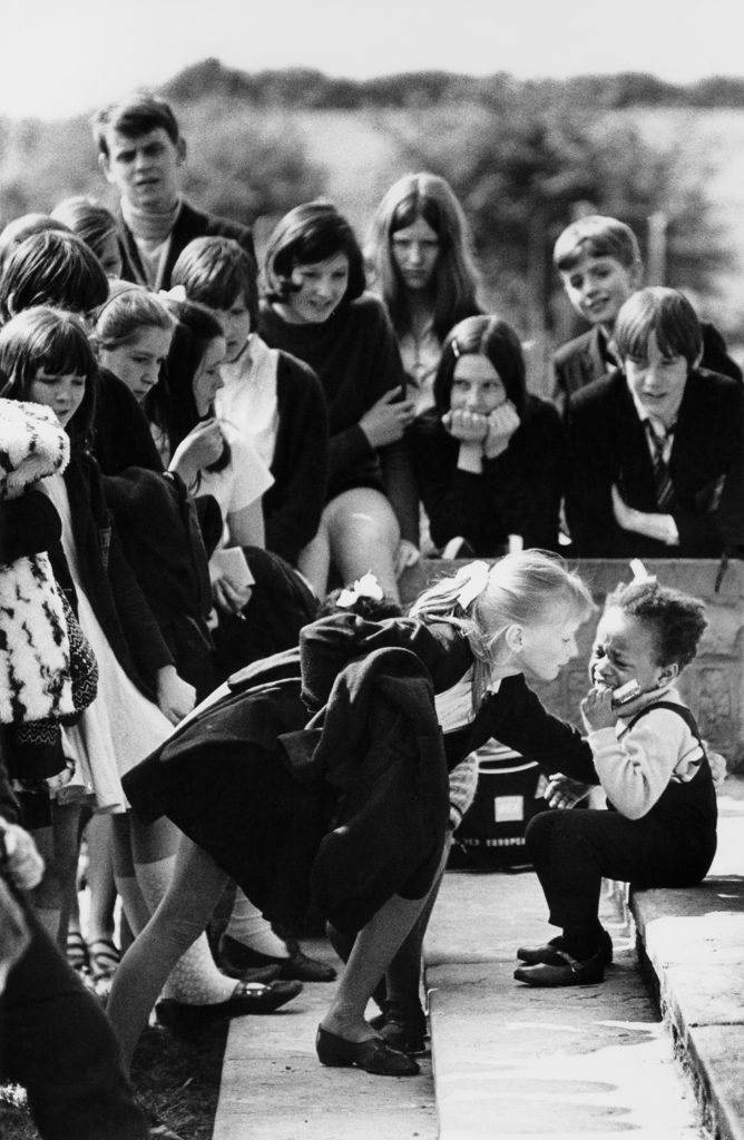
Well, here are some examples from my archives. One dates from 1969 and back when the first prints were made from this, with publication in The Guardian and various magazines, I used pencil and bleach to try to ensure the faces at the centre of the group were properly defined from the wall behind them. This was a very mild treatment and not very successful.

Here’s a not-totally straight print. Some detailed dodging and burning was done in the darkroom to try to get the definition needed between the blonde girl’s face and the wall. It was this lack of definition which meant it was never a real winner, though it did well enough in competitions. It was also taken on outdated Perutz film using a very cheap manual Hanimex lens – I was only 17 and could not afford anything more!

Vintage 1969 black and white print scan secondary school pupils crowd round a little black girl who has fallen and is crying at Maltby Grammar School sports day. Note the black child was one of twins from the only coloured family in this Yorkshire mining town and at this time there was no discrimination just a lot of attention.

Once scanned, the print could be retouched digitally, Photoshop giving much more accurate control of burning-in the tone of the wall behind the girls. This is the result – it’s not a huge change. and I do not think anyone would suggest it falsifies the image.

Vintage 1969 black and white print scan secondary school pupils crowd round a little black girl who has fallen and is crying at Maltby Grammar School sports day. Note the black child was one of twins from the only coloured family in this Yorkshire mining town and at this time there was no discrimination just a lot of attention.

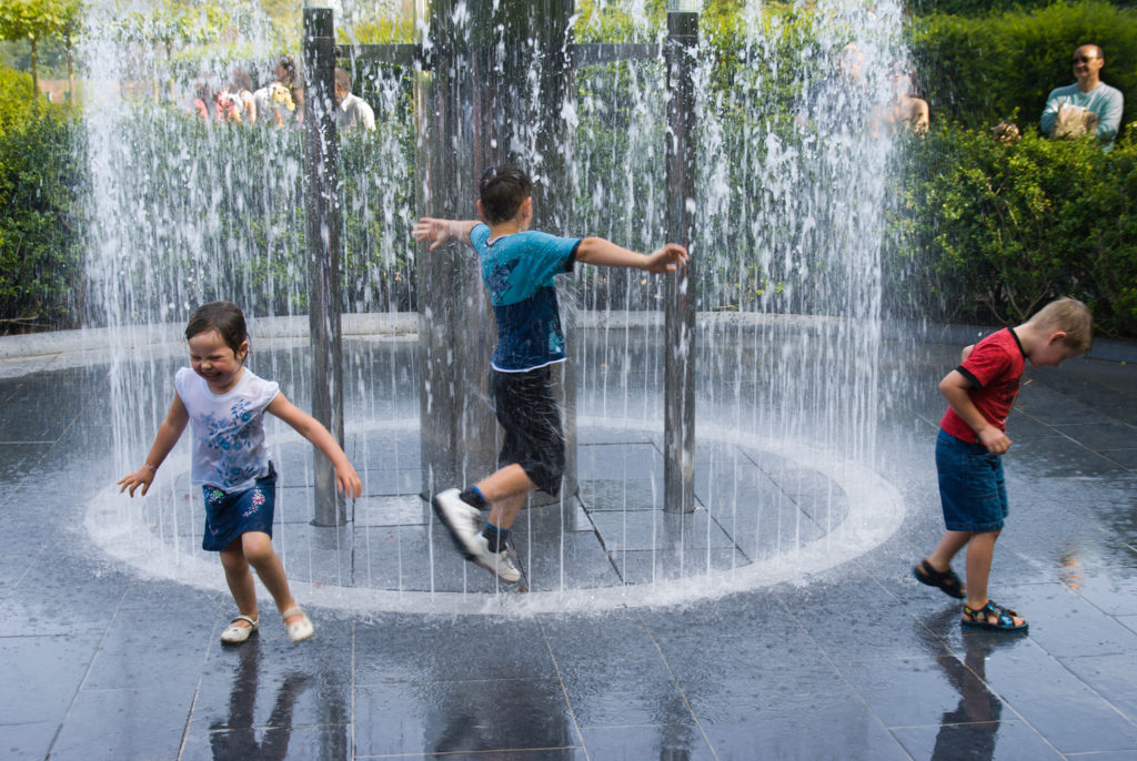
Moving on, here’s another group of children – three kids in the timed-burst water play fountain at Alnwick Castle Garden. It’s a picture I was very pleased to catch, the best of three frames with the children at the best critical moment for action and composition. But in the darkroom I would certainly have burned in the people in the background to reduce their distracting highlights.

Children run into a fountain released by build up of a head of water visible in a tube popular water feature in Alnwick Garden Northumberland UK

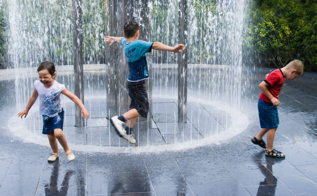
One of the principles of making a picture which works is to reduce it to a simple form. Extra faces always distract (we are drawn to look at faces regardless of composition). So, for this image, I retouched our the entire background scene. This would not be allowed by many competition, awards and some news or general media.

Children run into a fountain released by build up of a head of water visible in a tube popular water feature in Alnwick Garden Northumberland UK

Since I offer both images as licensable stock, with the retouched version clearly identified as retouched, I don’t feel there is any wrongdoing here.

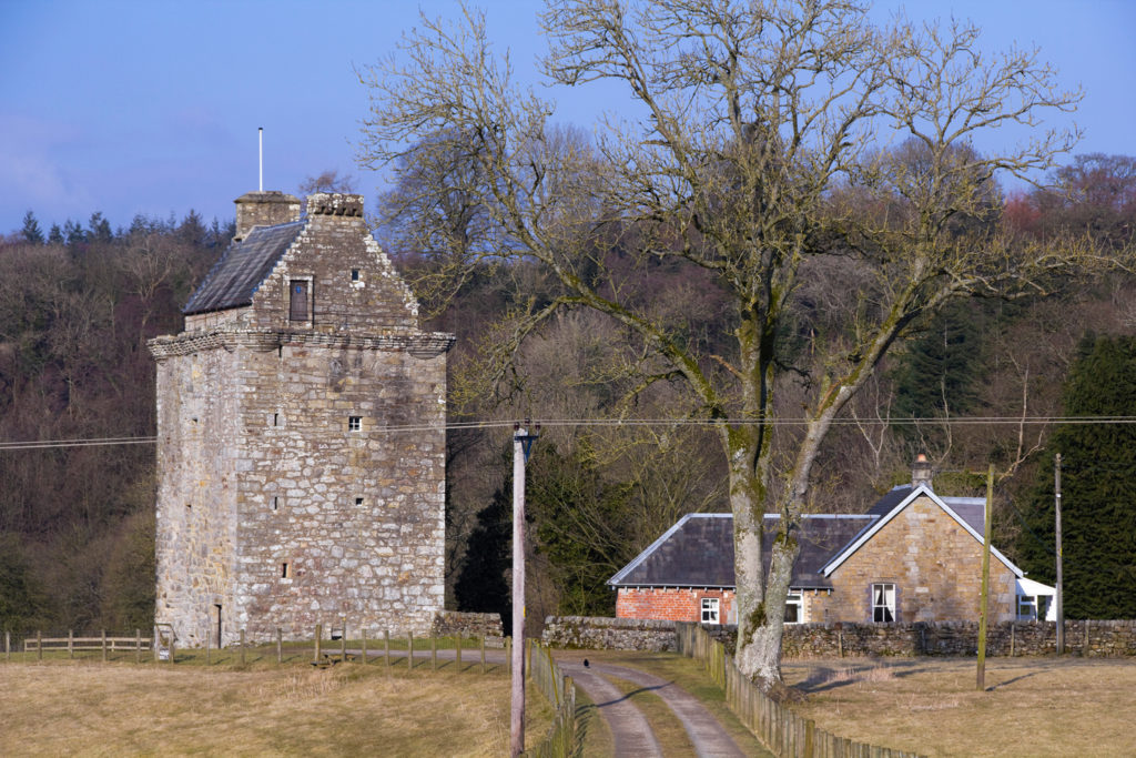
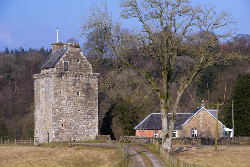
The next example is less controversial because it has no people at all. Wires interfere with the view of Hollows Tower, the old stronghold of the reiver Johnny Armstrong in the debateable lands as you pass from Scotland into England.

Hollows, the tower house of the Armstrong clan lairds of Gilnockie on the border between England and Scotland. Unretouched see also version with power lines removed from shot.

It’s not a massive task to remove the pole and wire mess. It falsifies the state of the scene, but only from a viewpoint which is not typical – most tourists see the tower as they drive past, from many angles.

Hollows, the tower house of the Armstrong clan lairds of Gilnockie on the border between England and Scotland. Retouched image with power lines removed.

I have not removed all the poles!

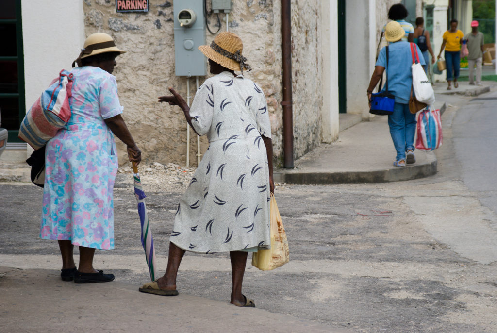
Finally, another example of where the infrastructure spoils the scene. In Holetown, Barbados, local ladies tend to dress up well to do the shopping and tend to stop to chat in the street. Even so, it’s a matter of framing and shooting quickly to catch a neat moment before they move on or something else gets in the way. And the wiring on the wall really does spoil the shot.

Barbados Holetown St Thomas parish west coast two Bajan ladies typically dressed chat on a street corner

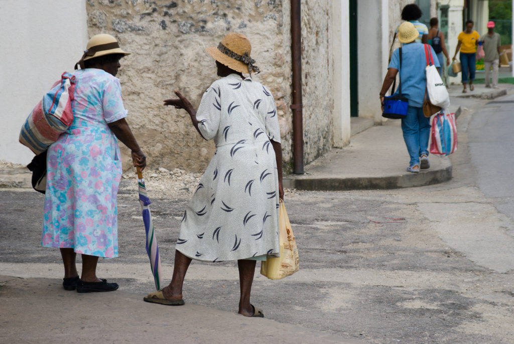
The retouching here was more complex. Is it a crime, or a routine part of modern photography?

Barbados Holetown St Thomas parish west coast two Bajan ladies typically dressed chat on a street corner retouched version

My work is generally used by travel guides, or in articles and books relating to people and places, travel and everyday life. The meter on the wall clearly documents the real place. The retouched image is an imaginary place. However it’s not been removed because it was an ugly meter. It’s removed because it spoiled a shot which I liked.

You can make your own judgments on Steve McCurry or his retouchers. Did they alter the pictures because they were really spoiled by the way they were? I feel I would have been happy with the unretouched image in most cases or used less obvious major changes.

– David Kilpatrick


Go wider than wide with Photomerge

In the latest incarnation of Photoshop, CS6, the Photomerge function is faster than ever before and leverages all the context-aware, pixel matching math of the previous versions enhanced to a degree you’ll find hard to believe.

Sony NEX and Alpha cameras have the same technology built-in for their sweep panorama mode, but anyone who’s used this frequently will know that failures happen, like stepped sea horizons and double imaged or squished-flat people.

Photoshop has the menu item Photomerge under ‘Automate’ in the File Menu. It is a panoramic stitching function, but it does not need you to shoot with a tripod or even shoot with care. You can stick a wide angle lens on your camera, take two pictures with radically different vanishing points, and still end up with a neatly stitched perspective.

What you need to know is how to NAME your images or what order to shoot them in. Contrary to what you might expect, Photomerge inherits its geometry from the LAST image in your sequence. So, if you have these three images:

This is the order you need to name them. I shot these with the bottom one first, of course – my level horizon straight-on shot. Then I aimed up, and then up again, overlapping three shots. If I then select these for Photomerge, Photoshop will correctly realise I want a vertical panorama stitch but it will not use the straight-on shot to set the image angle and geometry. It always picks the LAST shot, so I must rename my JPEG conversions 1, 2 and 3 as they appear above.

If your open tabs, or the stacked order of open windows, does not place the target perspective LAST you’ll get the wrong result. Here is what happens if the first shot (the bottom one above) is placed as the first tab in a multi-tab PS window, or the top window in a stack of separate windows, before adding OPEN FILES to the Photomerge window:

I used the NEX-7 with the 16mm f/2.8 SEL wide angle for these three shots. The composite, before cropping, measures a substantial 130MB. This technique enables you to use almost any wide-angle lens to create impossible wide views.

Here is the result when you stack the shots in the right order, so the program takes its perspective cues from the vertically-correct frame (the last one shown at the top):

You have no manual control over the perspective rendering. It’s all down to feeding Photomerge the right images, in the right order. Here is the fine tuned and cropped result:

This is an unretouched merge of the three frames. I’ve been trying this on various subjects, some rather silly, and Photoshop CS6 simply nails the merging even with focus, exposure or tilted camera errors. There are much lower cost programs which stitch images and do it well, but this takes a matter of a few seconds to create a final image equal to 40 or more megapixels. Not bad for a tiny 16mm lens!

Tip: instead of adding Open Images, browse and add one at a time, making sure the perspective-key shot is the last one added.

If you shoot architectural or landscape images, this function’s enhanced performance allows you to leave behind your 8mm. Except, of course, you don’t have one. If you do have an 8mm, welcome to the world of 5mm…

Added example – the next day…

I returned to the building (the other end of it) the day after posting this article because I wanted to add something far more complex, still shot by hand, using the NEX-7 and 16mm, showing just how amazing Photomerge has become. I wanted foreground and background elements, complex geometry and a matrix of shots not just a row of them.

Here is my matrix of shots – every one of these is an 85° diagonal view, 16mm on APS-C:

Here is the result of the Photomerge window before final adjustment and cropping:

This is a 400MB+ Photoshop document and over 200MB in flattened data size. Below is the final crop, with a small rotation and correction of vertical perspective:

This is a 119MB JPEG 6919 x 6013 pixels in size, no retouching has been used and the raw conversions are default with the 16mm E lens profile. Some fringes remain visible, the image could be downsized and corrected further. Remember.. this is the often-criticised 16mm which I find to be an excellent little lens. You can download the full size sRGB JPEG saved to Level 10 quality (14MB file) from the link below if you are Photoclubalpha subscriber. It will not appear if you are not a subscriber.

[private]

Subscriber Link

[/private]

– David Kilpatrick

Photoshop CS6 beta – download now!

LONDON, UK. — March 22, 2012 Adobe Systems Incorporated (Nasdaq:ADBE) today announced Adobe® Photoshop® CS6 beta, a preview of what’s to come in the next release of the industry standard in digital imaging, is available as a free download from Adobe Labs. Customers can download the beta, try out the experience and provide feedback to the product team. Packed with groundbreaking new innovations, features and incredible performance enhancements, Photoshop CS6 beta is available for the Mac OS and Microsoft® Windows® platforms. The final release is expected in the first half of 2012.

“Photoshop CS6 will be a milestone release that pushes the boundaries of imaging innovation with incredible speed and performance,” said Winston Hendrickson, vice president products, Creative Media Solutions, Adobe. “We couldn’t wait to share this beta of Photoshop CS6 with our customers and are looking forward to hearing from them and seeing the ways they are incorporating the beta into their daily creative workflows.”

New Features in Photoshop CS6 Beta

Photoshop CS6 beta demonstrates Adobe’s focus on huge performance enhancements, imaging magic and creativity tools that offer customers a new experience in digital imaging. Key features include new additions to the Content-Aware tools: Content-Aware Patch allows greater control by letting users select and duplicate an area of an image to fill in or “patch” another, and Content-Aware Move lets users select and magically move an object to a new place in the image.

Customers will experience incredible performance, powered by the new Adobe Mercury Graphics Engine*, enabling near-instant results from popular editing tools including Liquify, Puppet Warp, Transform and Lighting Effects; and a refined, modern interface featuring dark UI options to make images pop. New and re-engineered design tools make creating designs faster and more efficient. Vector layers allow users to apply dashed lines and gradient strokes, searchable layers quickly zero in on any layer, and new type styles let designers swiftly apply type treatments to their designs.

In addition, the Photoshop CS6 beta offers all the features of Adobe Photoshop CS6 and Adobe Photoshop CS6 Extended, such as new 3D editing features and quantitative imaging analysis capabilities. These features will be included in the shipping version of Photoshop CS6 Extended when it becomes available.

Pricing and Availability

The Photoshop CS6 beta is available immediately as a free download in English and Japanese. At installation, users will be required to provide an Adobe ID to complete a one-time login and online product activation. For information on how to install Photoshop CS6 beta, visit www.adobe.com/go/photoshopcs6. Customers can submit feedback via the Photoshop CS6 beta forum. Users can also connect with the Photoshop team via the community-powered site; on Facebook; YouTube; Photoshop.com blog; or via Twitter.

Free preview download – Perfect Layers

onOne Software have announced that a Public Preview of Perfect Layers is now available to download and try out, free of charge.

Perfect Layers is a standalone application that works on its own allowing you to create and edit layered Photoshop files. If you use Lightroom or Aperture and you’ve ever wanted to or wished you had the ability to create a layered file, then this is definitely for you.

Being able to take two or more files and combining them into a single layered file or taking a single image and duplicating it to create multiple layers and use blending modes to enhance them is very powerful and opens up all kinds of creative things you can do.

onOne have been working closely with Scott Kelby from the National Association of Photoshop Professionals on Perfect Layers to refine the feature set and get great ideas in general on Lightroom users need. Scott has been playing with early development builds of Perfect Layers and he (and the rest of his team including Matt Kloskowski and RC Concepcion) are very excited about the possibilities that Perfect Layers will bring to Lightroom users.

The Perfect Layers Public Preview will expire on June 30th, 2011. The final version, 1.0, will be available for purchase in mid-2011. At that time, Perfect Photo Suite 5.5 owners will receive a free product update that will include Perfect Layers 1.0. Suite owners and anyone interested in Perfect Layers can download the free public preview now.

Perfect Layers – free trial download

onOne Software are announcing that a Public Preview of Perfect Layers is now available to download and try out, free of charge.

Perfect Layers is a standalone application that works on its own allowing you to create and edit layered Photoshop files. If you use Lightroom or Aperture and you’ve ever wanted to or wished you had the ability to create a layered file, then this is definitely for you.

Being able to take two or more files and combining them into a single layered file or taking a single image and duplicating it to create multiple layers and use blending modes to enhance them is very powerful and opens up all kinds of creative things you can do.

onOne have been working closely with Scott Kelby from the National Association of Photoshop Professionals on Perfect Layers to refine the feature set and get great ideas in general on Lightroom users need. Scott has been playing with early development builds of Perfect Layers and he (and the rest of his team including Matt Kloskowski and RC Concepcion) are very excited about the possibilities that Perfect Layers will bring to Lightroom users.

The Perfect Layers Public Preview will expire on June 30th, 2011. The final version, 1.0, will be available for purchase in mid-2011. At that time, Perfect Photo Suite 5.5 owners will receive a free product update that will include Perfect Layers 1.0. Suite owners and anyone interested in Perfect Layers can download the free public preview now.

ACR 6.2 and LR 3.2 RC released – for NEX

Adobe has announced the Lightroom 3.2 and Camera Raw 6.2 Release Candidates, available for immediate download on Adobe Labs. The updates extend raw file support to 12 new popular camera models including the Sony NEX-3 and NEX-5, Alpha 290 and 390; improve on several of the lens correction profiles introduced as part of the Lightroom 3 and Camera Raw 6.1 releases; and add over 50 new lens profiles to help photographers automatically correct for undesirable distortion and aberration effects.
But they let Sony down in a big way by only including the 18-55mm OSS lens for NEX, omitting the 16mm which must be very simple to profile (after all folks, there are only TWO officially available lenses for NEX right now – you found time to profile no fewer than 15 lenses for the Pentax AF645, for the benefit of all two dozen worldwide users of this outstandingly popular digital option…)
For ACR 3.2 Release Candidate download – http://labs.adobe.com/wiki/index.php/Camera_Raw_6.2
For LR 3.2 Release Candidate download – http://labs.adobe.com/wiki/index.php/Lightroom_3.2
In addition, the Lightroom 3.2 Release Candidate now allows Lightroom 3 customers the ability to publish their photos directly to Facebook from within the application, and addresses issues reported by customers on the Lightroom 3.0 release. Adobe continues to encourage the community to provide feedback on the updates so it can ensure the highest quality experience for customers working on a variety of hardware and software configurations.
Pricing and Availability
The Lightroom 3.2 Release Candidate is available as a free download for Lightroom 3 customers, and the Photoshop Camera Raw 6.2 Release Candidate is available as a free download for Photoshop CS5 customers. For more information and to test out the updates visit http://labs.adobe.com. Feedback can be provided on the Adobe User to User forum at http://forums.adobe.com.
*Please visit the Lightroom Journal for more information on these Release Candidates and a full list of the improved and newly added lens profiles: http://blogs.adobe.com/lightroomjournal
Newly Supported Camera Models
Panasonic DMC-FZ100, Panasonic DMC-FZ40 (FZ45), Panasonic DMC-LX5, Pentax 645D, Samsung NX10, Samsung TL500 (EX1), Sony A290, Sony A390, Sony Alpha NEX-3, Sony Alpha NEX-5
Also, this update improves the colour and noise profiles for the following cameras that utilise the DNG raw file format already supported in previous versions of Lightroom and Camera Raw: Casio EXILIM EX-FH100 (DNG) and Leica S2 (DNG).

Lightroom 3 Beta 2 – the high ISO wunderkind

I’m not going to bore you with countless 100% clips. Just open this one file. It is a 100% screen shot of a tiled view of the same raw file from a Canon EOS 550D (aka Rebel T2i), taken at ISO 6400.

On the left, you see what Adobe Camera Raw 5.6 does with this file using no sharpening, 25 Luminance NR, 50 colour NR. On the right, you see what LR 3 Beta 2 does using the same settings (LR noise reduction has some further options – these are not adjusted).

When exporting the LR image to Photoshop, a dialog box appears saying you may need to install Adobe Camera Raw version 5.7! At the time of writing, version 5.7 is not yet available. But LR3 Beta 2 knows it exists… I used LR Rendering for this sample.

Click the image, open the full size screen shot. Or view it at
http://www.pbase.com/davidkilpatrick/image/123036282

The 12,800 shot is by no means bad either. You could compare it with ISO 1600 shots from the first 10 megapixel CCDs.

Trust me, the LR 3 Beta2 result is superior both to the Canon in-camera JPEG and the Canon DPP processed result. Had I the time I’d post examples of every ISO from 100 to 12,800 and you would see something very special – the increase in size of ‘grain’ with each speed step, but nothing more. NOTHING more than a proprotional increase in grain size, just like film  used to be.

No oatmeal. No porridge. No hot pixels, no smeary watercolours. No colour blurring and luminance smoothing. Just neat, tight, virginal grain. Hmm. I should not have said that. Even so…

And another things – it works on everything. It works on old files, new files. RAW files from before the Ark got stuck on Ararat. Night shots taken when night shots could only make 7 x 5 inch prints. Nikon, Canon, Sony, old Minolta, Pentax, Olympus – download this beta, and you just discovered great pictures in the stuff you thought was rubbish because you accidentally used ISO 800 when that meant shaking the pepperpot over your soup!

Go download! http://labs.adobe.com/technologies/lightroom3/

Tip: to use Lightroom use a front end, just set Photoshop as your editor, and after adjusting the pic hit Command-E – same as hitting the Open button in Adobe Camera Raw. Go straight to Photoshop, Do Not Pass Go, and do not (yet!) spend £200!

– DK

1 2 3 4