KM’s unique 7D/5D colour vs. the rest
THE question is being asked, will the Alpha 700 match the rich colour rendering of the Konica Minolta 7D and 5D? These cameras had identical colour profiles, and were in turn very similar to the Dimage A1 and A2. The Sony Alpha 100 proved very different. Here’s my best attempt to explain why.
The native colour profile of a digital camera depends partly on how the image is processed, but also on the spectral transmission values (bandpass) of the RGB filter which are printed in a pattern on the sensor. The silicon itself has an effect, and so does any UV and IR cut-off filtration built in to the cover glass or anti-aliasing filter of the sensor. One raw file converter, Phase One’s Capture One Pro or LE, uses standard ICC camera profiles which are stored in your computer’s directory for ColorSync (Mac) or Windows ICM.
While it is not possible to compare camera profiles used by different applications, we can look at the Capture One profiles and see direct relationships and contrasts between cameras. Using Apple’s ColorSync Utility on Mac – part of the system software – each colour profile can be viewed as a colour space graphic. It looks two-dimensional but it is actually a view of a solid, and can be rotated in three dimensions. The default view is the familiar one and most useful.
The bigger the area of the graph square occupied by the graphic when viewed, the wider the gamut of colours involved. In theory, a profile which shows the camera capturing everything, a profile going beyond the graph area on all sides, is able to record extreme hue values, more hues, and greater saturation. Here are two common colour spaces to start with, both viewed using the ColorSync Utility.
sRGB – this represents the entire range of colours you can see on most computer screens and reproduce on photographic paper (C-type) or 3/4 colour inkjets. It doesn’t quite work that way, but sRGB is a very safe and limited range of colours:
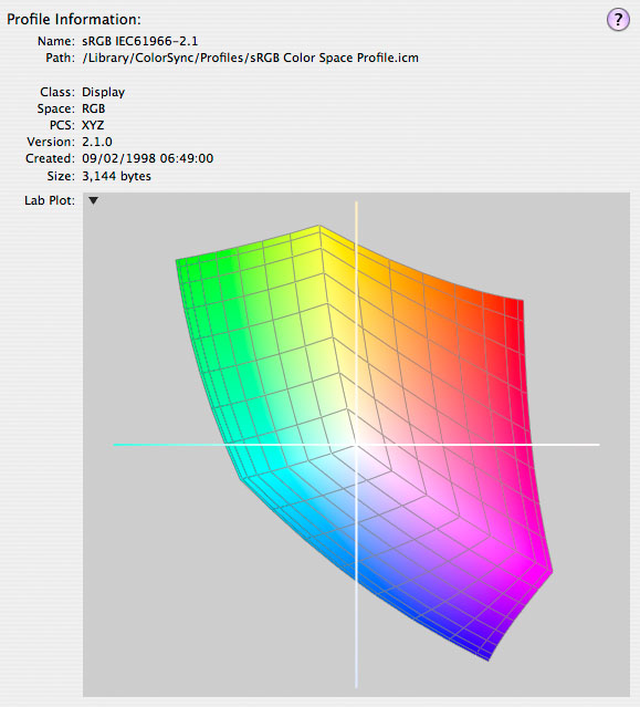
You will notice that the grid lines on this colour space are fairly evenly spaced, getting a bit tighter towards the extremes. This is normal. sRGB is an 8-bit per channel colour space. It only has 256 steps to use for each of the three primaries R, G and B to reproduce the whole spectrum (and add the dimension of neutral density, for darker colours, which is not shown in this view of the profile). As you get the extremes of the colour map it’s squeezing the data a bit. There are plenty of smooth steps available for medium toned mixed shades; the lowest possible number of steps available is for pure primaries.
AdobeRGB is a larger colour space. This represents most of the colours you can print by any process including inkjets with six, eight or more additive and subtractive primaries. It is also fairly close to the most colours you can expect to capture on a typical DSLR:
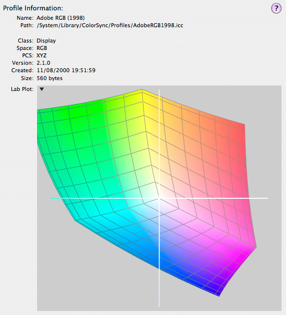
In fact you can’t display all these colours on a normal computer screen. There are a few very expensive certified AdobeRGB monitors made, but a typical CRT/TFT won’t get there. You can see this graph of course, it’s just a representation of colours and all these graphs are displayed using sRGB! You will notice that the maximum red saturation is shown as fairly weak, and the colours look soft. The grid is more widely spaced.
You should also realise that if we are still using an 8-bit per channel image (24-bit, 16 million colours, 256 steps per channel) there will be less accuracy available to describe the colours. We are using 256 steps to cover a wider gamut. There is more chance of banding (posterisation), tone-breaks, and image noise. AdobeRGB is the reason that many blue sky tones look noisy from DSLRs even at 100 or 200 ISO. It combines with the false bit-depth performance of many modern LCD/TFT flat screens to show exaggerated differences between adjacent pixels and then quantize these for display purposes. The latest Sept 2007 Apple 20 inch iMac screen, for example, is only an 18-bit display – 6 bits per channel. It can not display digital images smoothly because it is forced to work in steps instead smooth gradients. AdobeRGB images will often look much higher in noise. Banding can be reduced by enabling ‘Use Dither’ in Adobe Photoshop Colour Settings, ‘Advanced’ options. But Dither is noise – created noise – and may make you tear your hear out trying to cure noise which is not even part of the image.
If you display an AdobeRGB image using a profiled system, the soft colours you see will be remapped to match the bright, tight colours of the first graph – sRGB. That’s what colour profiles and colour management are there for. If you display an AdobeRGB image without colour management present, it will look flat and soft just like the graph. Images for web sharing and display should always be saved as sRGB not AdobeRGB. So should images for printing on card-slot printers, cable connected printers. Both KM and Sony change the filenames of AdobeRGB images to make sure PictBridge and EXIF Print machines won’t even see them, to avoid flat colourless result being blamed on the camera.
Now let’s look at the Konica Minolta 7D/5D profile:
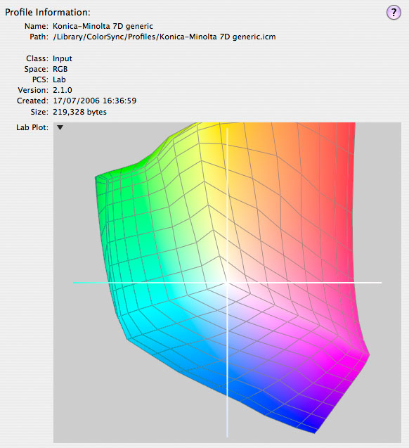
It is bigger than sRGB, and a slightly different shape than AdobeRGB. It has more gamut in the red direction and it’s a bit tight on the green end. The grid is fairly evenly spaced. It is not possible to say anything about this graph just from this single view, but it’s a result of normal density – fairly narrow-bandpass – colour filters. The colour filters on the 7D and 5D sensor were said at the time of the 7D launch to have been specified by Konica colour emulsion film scientists working with Minolta colour measurement scientists. Whether this is true, or just marketing talk, will never be known.
One thing is certain – the 7D was the first camera using this 6 megapixel Sony CCD to have a lower ISO limit of 100, and this may indicate that the filters were higher in density or had more specific bandpass characteristics. It seems to be have been difficult for makers to get the standard CCD down below 100 despite urgent demand for this from professionals using studio flash; unlike the standard ISO 160 colour film, digital shots can’t be overexposed without problems.
For comparison, let’s look at the profile graph for a camera which is known for relatively weak colours – the original Canon 1Ds (not the Mark II, which improved this aspect):
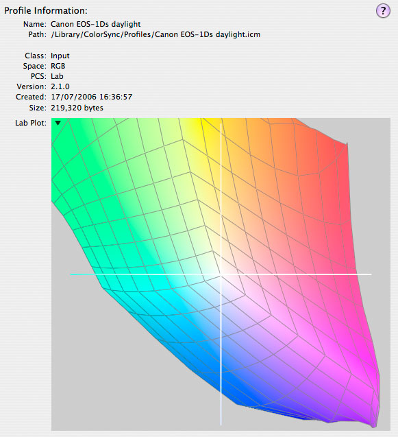
The Canon 1Ds grass colours are known for being weak, and you may be able to deduce from this Capture One profile why that is so. The camera clearly has a very large gamut, bigger than AdobeRGB, but if you were to ‘clip’ the sRGB space from the middle of this graph you would be left with a very flat image. Instead of clipping (discarding colours which a colour space can not reproduce) it is normal to remap the limits of the source space to the limits of the target space, using a set of rules known as ‘Perceptual’ rendering (to match how humans best see the remapping) or ‘Relative Colorimetric’ rendering (mathematically proportionate).
If your raw file converter is not fully aware of the big spread of source colours the Canon is capturing, the resulting conversion may be inaccurate. If you want an sRGB file and have a profile aware converter, it is bound to be inaccurate because the gamut is so much larger than sRGB – vivid colours which can not represented (the extremes of the space) will be remapped to the position of those vivid colours you can see at the edges of the sRGB space. Normal colours will all move inwards to the centre, with less saturation but not more lightness, remember this is a view of a 3D space and that lightness is the top of a pyramid.
It is possible that the Canon captures a wider gamut because slightly less dense RGB filters are used on the CMOS sensors. This would be to help counteract their lower sensivity, and also to ensure lower noise. Weaker colour filters not only admit a wider overall spectrum, their lower discrimination reduces luminance differences within the Bayer pattern, and chroma noise in the final deBayered image file. As Canon’s CMOS technology has advanced, the colour profile of the cameras has become more consistent and normal. The EOS 5D, 30D and 400D, for example, are not unlike the Dynax 7D.
Imagine a sensor with no filters. It would capture a huge gamut – every wavelength would get through – but it would be luminance only and the colours on that graph would fade to a set of greys as well as extending beyond the frame on all sides. One with very dense filters would have a vivid colour graph but tightly placed, like sRGB.
Well-proportioned colour
What makes the Konica Minolta ICC profile from Capture One Pro so revealing is how very similar it is, in colour and proportional shape, to sRGB and AdobeRGB – the two colour spaces of the in-camera JPEGs. It needs to be transformed one way for sRGB, another way for AdobeRGB, but neither transform involves big warps of that grid or rotation of the shape. This means minimal data loss during conversion from .MRW to these target spaces. The 12-bit per channel raw data is also being used very efficiently to record fine graditions within the colours we can actually see on screen and reproduce in prints, rather than to capture a gamut which then needs clipping or compressing.
Some users will say that they think the rich colours of the KM 7D and 5D represent a wider gamut. That’s not correct. They actually represent a narrow gamut, closer to the working spaces we end up with. A kids’ box of poster paints is a very narrow gamut although it looks bright. A Macbeth ColorChecker is also an extremely limited gamut. Big colour gamuts involve colours you can’t print at different luminosities which make them hard to record in the same shot – bright skies, sun hitting primary coloured objects, or light through a stained glass window.
So, when I say that the Sony A100 has a wider capture gamut (probably because it does not use very strong RGB filters, but not weak either, and has an extended dynamic range) it does not mean the colours will have the vibrance and realism of the 7D/5D sensor with all the extra shades and gradations it has at its disposal for the more limited gamut it handles best. Here is the A100 profile:
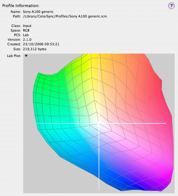
As you can see, the A100 captures good strong colours with a better range of blues and sky tones especially, rather more scope for bright greens and yellows, and not such positive reds. It is the loss of those tight sRGB-style reds which the average 7D laments in the A100, and from this graph you can see why there is a difference. But this is not a bad colour profile graph – it doesn’t have as many irregularities as the Canon 1Ds, but it tends to pull some green hues around a bit. That’s probably the sunny Sony spring green grass colour preference!
These profiles are not entirely a result of filters, RGB or AA/IR cut. The gain levels and transfer curves applied in the A-to-D conversion have their own effect before the data is locked down into the monochromatic Bayer RGB file, to be interpreted as RGB colour by programs like Capture One Pro.
Capture One Pro, by using these profiles Phase One have created, should yield very similar final colours from a wide range of different cameras. Adobe Camera Raw 4.1, a popular choice for file conversion, using more generic colour profiles which are not accessible in the same way and gives very different results for every camera type. It is possible to create a calibration (a type of profile) for ACR 4.1 for each camera, and this is something which I need to look at in future. In the meantime, pay special attention to ACR ‘White Balance’ as this is the main source of colour errors when converting Alpha 100 images.
You can download a trial version of Capture One Pro from:
http://www.phaseone.com/Content/Downloads/CO4.aspx
This is the beta trial of version 4 – no advance inclusion of the Alpha 700, but of course the entire KM/Sony DSLR range up to this is included, along with the Dimage A1, A2 and A200.
– David Kilpatrick

Great article David. I found it very informative indeed, thank you.